
Summarise this article with:
The key to readable YouTube thumbnail text on phones is to design for the smallest preview size, which YouTube reduces to roughly 200×113pixels and then places in a 168×94pixel sidebar. Ensure that any text or facial detail remains clear at those dimensions, because only this test determines whether viewers can actually read the thumbnail on mobile devices.
Sharp on desktop means nothing if it dies on mobile. YouTube crushes every preview to roughly 200x113px, and shoves that same image into a 168x94px sidebar box. Text or face details that vanish at those dimensions fail the only test that matters: getting read.

Photo: Samer Daboul via Pexels
Open the Image Cropper. Set the canvas to 1280x720px. Drop in a temporary guide box matching mobile thumbnail dimensions. Zoom out to that box. Now you see the truth. My headline turned into a blurry smear the second I did this. Size and contrast demanded a complete rethink. The moment you toggle between the full-size canvas and the mobile preview you’ll notice how quickly details dissolve. That is why many creators spend hours polishing a design that never makes it past the thumbnail carousel on a phone. A quick pass with the contrast tool shows you instantly whether your text survives at small sizes.
Limit to Two Elements
Two elements. That is your absolute limit across any niche. Pair a face with a short headline, or run two complementary graphics. Anything more crowds the tiny space and sends the eye wandering.
Keep text size at 100pt or higher on the full-size canvas. This guarantees a legible height once YouTube compresses the image. Let your portrait occupy 40-60% of the frame. A smiling, eye-wide face grabs attention first, pulling the viewer into the headline. Contrast wins every time. Stick to light text on dark backgrounds, or dark text on bright backgrounds. Busy backgrounds require a solid block behind your words.
The human eye demands this hierarchy. Viewers land on the largest, highest-contrast element first, then jump to the next point of interest. Clear hierarchy guides their path without overwhelming them. In practice, you’ll find that a thumbnail with a single bold word and a face outperforms a cluttered design even when the latter uses brighter colors. The brain prefers a quick visual shortcut.
What Goes Wrong When You Exceed Two Elements?
When you add a third icon, a secondary text line, or a decorative border, each item competes for the same few pixels. The result is a loss of visual weight; the eye can’t decide where to focus, so it moves on. On a 200-pixel wide preview, a third element often collapses into a fuzzy blob, making the thumbnail look unprofessional. Creators who ignore this rule see a dip in click-through rate (CTR) of 10-15% after a redesign that added extra graphics.
Color Strategy
YouTube leans hard on red. Using that hue for your thumbnail blends it into the interface. Pick colors that pop against the muted UI palette instead. Yellow and black deliver the highest contrast ratio for tiny text. High-saturation blues and greens stand out without clashing with YouTube branding. Solid color blocks behind the headline guarantee readability even against complex background images.
Drop gradients. A gradient fading into the middle of an image becomes flat gray at 200x113px. You lose the visual punch entirely. Gradient transitions rely on subtle shifts that the compression algorithm smooths out, leaving a uniform tone that no longer separates foreground from background. If you must use a gradient, confine it to the outer edges where it won’t be sampled in the mobile preview.
Honest Limits of Color Choices
Bright neon colors may look eye-catching on a monitor, but on a small phone screen they can bleed into each other, creating a halo effect. Likewise, pastel shades often fall below the contrast threshold required for legibility. Test your palette by converting the thumbnail to grayscale and reducing it to 8-bit depth; if the text still reads, you’re safe.
Facial Expressions That Convert
Faces convey emotion faster than anything else. Open-mouth smiles, wide eyes, and raised eyebrows drive click-through rates dramatically. Match the expression to the video tone. Reaction videos need surprise. Tutorials demand calm confidence.
Skip the exaggerated poses. Scan your raw footage for moments where the subject's eyes open fully and the mouth hints at excitement. Pair that single frame with a bold headline. You get a magnetic hook.
Why Some Faces Fail
A face that is too far away or partially occluded will shrink into an indistinct shape at thumbnail size. Even a well-lit portrait can become a gray blob if the background is busy. The solution is to isolate the subject on a plain or slightly blurred backdrop and increase the contrast between the face and the surrounding area. If you notice the eyes disappearing in the mobile preview, move the subject closer to the camera or crop tighter.
Crafting Text Hierarchy
Treat thumbnail text as a three-level hierarchy, even if you only use one line.
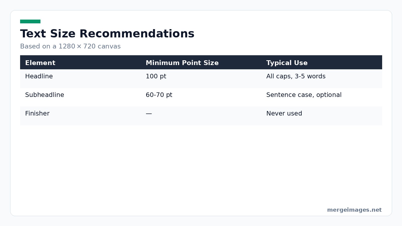
- Hook: The headline. Use all caps, 100pt+, and keep it to three-five words. Example: "UNLOCK QUICK GROWTH".
- Secondary: Optional subheadline. Drop to 60-70pt, sentence case, and only add it if you need extra context.
- Finisher: Never add body copy. The thumbnail is a visual invitation, not a brochure.
Adjusting contrast with the Contrast Image tool made my white headline pop against a dark blue backdrop. The words remained crisp even at the smallest mobile preview. That single tweak separates a click from a scroll-by.
Practical Pitfalls
- Kerning collapse: At tiny sizes, letter spacing can merge, making words unreadable. Increase tracking by a few points when you set the font size above 100pt.
- Font weight mismatch: Thin fonts lose their shape after compression. Stick to bold or extra-bold weights.
- Stroke overload: Adding a thick outline to text can improve contrast, but if the stroke is too wide it eats into the letters, making them look cramped. A 2-pixel stroke on a 100pt font is usually enough.
File Specs and Compression
YouTube demands a minimum resolution of 1280x720px, a 16:9 aspect ratio, and a file size under 2MB. Stick to JPEG as your default format. Reserve PNG strictly for transparency.
Run your finalized design through the Image Compressor. The tool strips kilobytes while preserving visual quality. Your thumbnail loads instantly on any device. Fast loading keeps viewer attention locked on the content, not a spinning wheel.
When Compression Breaks Things
If you push JPEG quality below 70%, you’ll notice banding around gradients and a loss of sharpness on text edges. The thumbnail may look fine on a desktop preview but become illegible on a phone. Always export at 80-90% quality, then run the compressor and re-inspect the mobile preview.
A/B Testing Your Thumbnails
Since 2024, YouTube Studio enables split testing for thumbnails. Create two distinct versions. Change the hook text, swap color schemes, or use a different face. Let YouTube serve each version to a random half of your audience. Compare the click-through rates after a few days and keep the winner.
Testing never stops. Refresh thumbnails every quarter on underperforming videos. Monitor the data. Moving a headline a few pixels left to avoid the timestamp overlay can lift CTR noticeably.
How to Interpret Results
A 2-point CTR lift may look small, but on a channel with 100,000 daily impressions it translates to 2,000 extra clicks. Watch the audience retention curve as well; a better thumbnail can attract viewers who stay longer, feeding the algorithm positively.
Common Pitfalls
Designing Only at Full Size
Never finalize a thumbnail without checking the mobile preview. The tiny version reveals problems that the desktop view hides.
Ignoring the Timestamp Zone
YouTube places the video duration in the bottom-right corner. Keep important text or graphics out of that 20% of the frame.
Over-branding
A subtle logo in a corner is fine. A large watermark across the image kills readability and looks spammy.
Uniform Templates
If every thumbnail looks identical, viewers stop noticing them. Introduce visual variety while maintaining brand consistency.
Misreading Analytics
Some creators chase a higher CTR without looking at watch time. A thumbnail that attracts clicks but leads to early exits can hurt overall performance. Balance eye-catching design with an honest representation of the video content.
Bottom Line
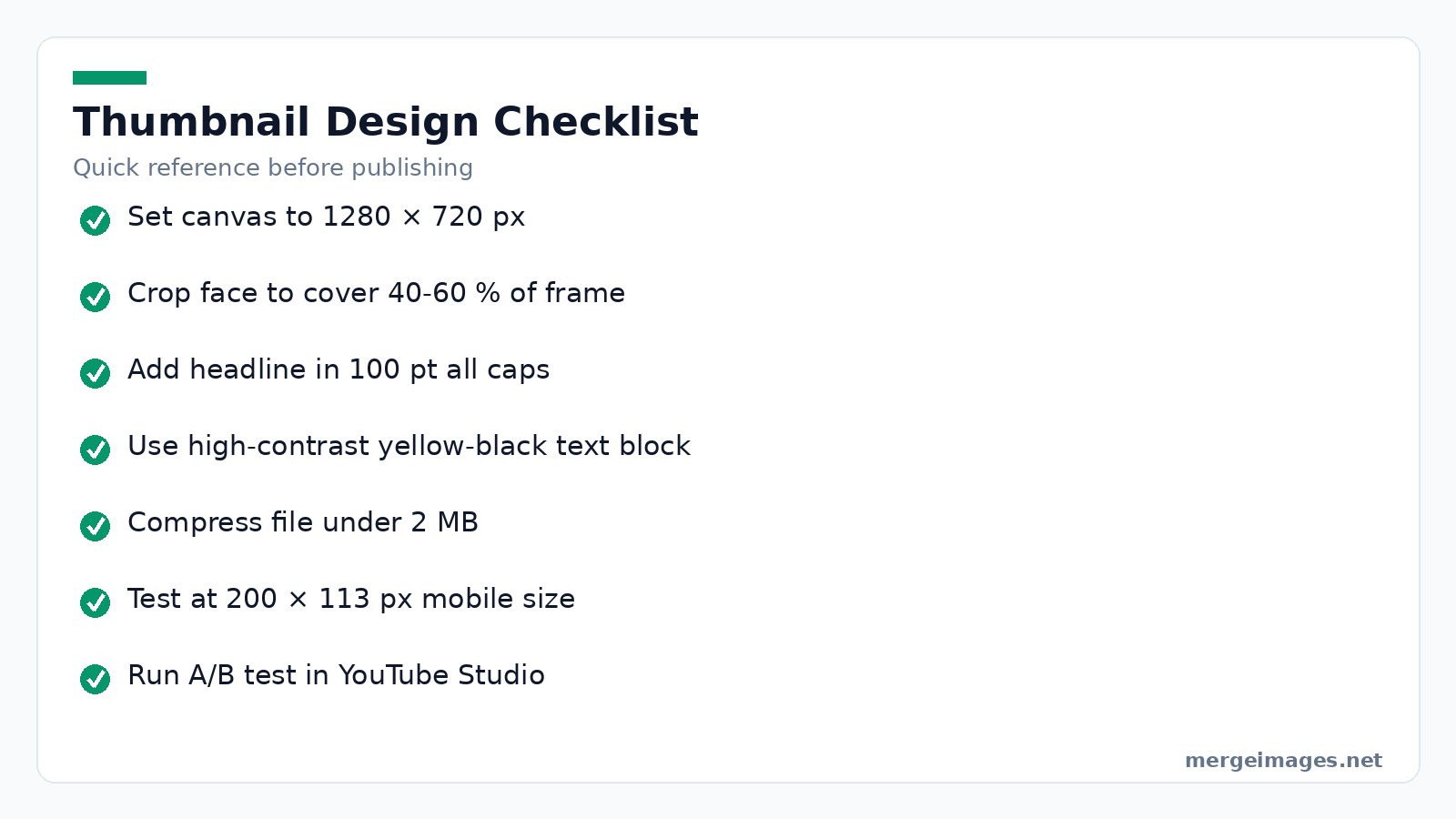
Your thumbnail must survive the 200x113px test. Feature no more than two elements. Use 100pt+ all-caps headlines. Showcase an expressive face. Apply high-contrast colors, compress the final file, and run an A/B test in YouTube Studio. Follow these steps and your thumbnails will read clearly on any phone, driving more clicks and higher watch time.
Frequently Asked Questions
How much do thumbnails actually matter?
A lot. Changing a thumbnail can swing views by several times in the first day. The algorithm reacts to those early numbers.
Should I use my face on every thumbnail?
If your channel revolves around personality, yes. Topic-focused channels can use a strong visual, but a face still adds a human touch.
What about the YouTube Shorts thumbnail?
Shorts default to the first frame. You can upload a custom 1080x1920 image. Apply the same readability rules in a vertical layout.
How fast should I update thumbnails on existing videos?
Swap underperforming thumbnails every three months. High-performing videos rarely need changes unless you rebrand.
Does font choice affect mobile readability?
Yes. Use a single, bold, non-cursive font that stays legible when reduced. Thin lines disappear at small sizes unless you add a strong stroke.

Bello builds useful software and writes thoughtful content to make sense of it all. He tests the tools himself and checks the facts before any of it goes in a guide.
Try Our Free Image Tools
Ready to Try It?
Put these tips into practice with our free online image merger. No signup required.
Make your social images, free


