
Summarise this article with:
Answer Capsule
Pick a 1080x1080px square for feed posts across Instagram, Facebook, LinkedIn, Twitter and Pinterest in 2026. It renders reliably without weird cropping and keeps payload small. Switch to 1080x1920px for stories and vertical video thumbnails. YouTube thumbnails demand exactly 1280x720px.
Why One Size Can Rule Them All
Algorithms reward fast loading visuals without distortion. A 1080x1080px file slips under typical max width limits around 2kpx yet retains enough detail for retina screens. Square formats map directly to Instagram’s grid and nest inside Facebook and LinkedIn feed cards. You bypass the ugly top and bottom crop Instagram forces onto 1080x1350px portraits.
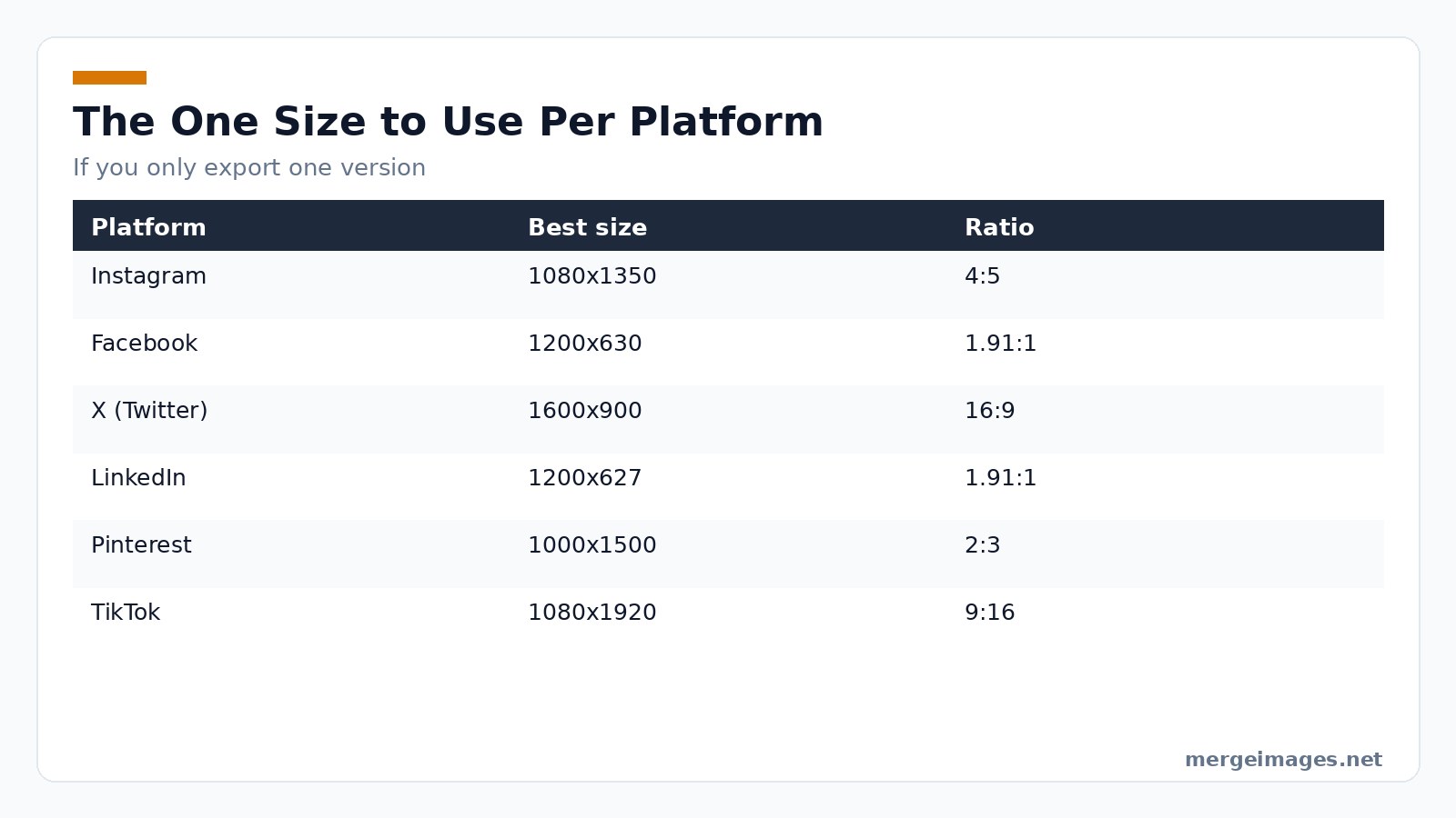

Photo: Bastian Riccardi via Pexels
Vertical stories and YouTube thumbnails break this rule. They need taller or wider canvases. Build your master template at the largest needed dimension. Use 1080x1920px for stories. Crop down to 1080x1080px for feeds. You maintain a single source file and let the browser handle the rest. The image cropper locks the exact ratio while you pick the framing.
The One-Size-Fits-All Cheat Sheet (2026)
| Platform | Feed Best Size | Story / Reel Size | Thumbnail Size |
|---|---|---|---|
| 1080x1080px | 1080x1920px | 1080x1080px (carousel) | |
| 1080x1080px | 1080x1920px | 1200x630px | |
| Twitter/X | 1080x1080px | , | 1200x628px |
| 1080x1080px | , | 1200x627px | |
| TikTok | , | 1080x1920px | 1080x1920px |
| 1080x1080px | 1080x1920px | 1000x1500px | |
| YouTube | , | , | 1280x720px |
Full printable version lives in our social-media-image-sizes-cheat-sheet-2026 page; the master reference with every niche dimension remains at image-sizes-for-every-social-media-platform. Batch-export each variant with the image resizer from one master image.
Common Pitfalls and Honest Limits
Aggressive JPEG compression blurs fine text. Fix this by running images through MergeImages’ /image-compressor using the WebP high quality preset. Keep final files under 150KB for feeds and 250KB for stories. Watch for color profile shifts too. Platforms sometimes convert sRGB to a limited palette which causes gradient banding. Export using the sRGB IEC61966-2.1 profile to match the web standard. Mobile interfaces on Instagram and Facebook trim 10% of vertical edges. Push logos and call-to-action text at least 100px inward from any edge. File size caps matter. Instagram limits feed images to 30MB. Facebook allows 100MB but recompresses anything over 5MB. Stick to the 150KB ceiling to avoid automatic re-encoding. Finally, when followers share your post to their story, platforms might apply a 4:5 overlay. Design with a 1:1 core and a 1080x1350px safe area to keep essential content visible.
How to Turn One Master File Into Platform-Ready Assets
Step1: Resize to the Largest Canvas
Open your original artwork in any editor. Drop it into MergeImages’ /image-resizer. Set width to 1080px and height to 1920px. Lock the aspect ratio icon. You will see black bars if the source lacks height. This is perfect for checking safe zones.
When I resized a 2500×2500px photo to 1080×1920px, the tool automatically added transparent padding on the sides, keeping the central subject intact.
Step2: Crop the Feed Version
Switch to /image-cropper. Choose the Square 1:1 preset. Drag the crop box to center your most important visual. The preview shows exactly how the image appears on Instagram, Facebook and LinkedIn feeds. Click Apply and download the 1080×1080px PNG.
Step3: Export the Story Version
Return to the 1080×1920px canvas from Step1. You need no further cropping. Just hit Download. You now have a story-ready file for Instagram, Facebook, Snapchat and TikTok.
Step4: Fine-Tune for YouTube
For YouTube thumbnails, use /image-resizer again. Enter 1280×720px. YouTube prefers a 16:9 ratio. The tool will automatically trim excess height. It preserves the focal point you placed in the safe zone during Step1.
Step5: Optimize File Size
Run the image through /image-compressor before uploading. Choose WebP high quality to shave off kilobytes without noticeable loss. Smaller files load faster. This positively influences platform ranking algorithms.
When to Break the One-Size Rule
Some campaigns demand portrait-heavy layouts like a fashion lookbook. Start with a 1080×1350px canvas in those cases. Follow the same cropping workflow to generate a square fallback. Keep all text and logos at least 100px from the edges. Instagram’s feed crop will clip them otherwise.
Real-World Workflow Example (No Fictional Stats)
- Create a 1080×1920px design in Photoshop.
- Upload to MergeImages then use /image-resizer. Set to 1080×1920px and confirm no upscaling.
- Crop to square via /image-cropper to 1080×1080px.
- Compress both files with /image-compressor using WebP at 85% quality.
- Publish the square on feeds, the tall version on stories, and the 1280×720px thumbnail on YouTube.
You just turned one master asset into five platform-ready images in under ten minutes. You never left the browser.
Edge Cases and Platform Quirks
Even with a solid master file, a few hidden behaviours can sabotage a campaign. On Facebook, a feed image that contains more than 20% pure white may be auto-converted to a PNG, inflating file size dramatically. Mitigate this by adding a subtle gray overlay (1-2% opacity) before compression. LinkedIn applies a 1.91:1 crop to link preview images regardless of the original aspect ratio; if you need the full square to appear, embed the visual inside a 1.91:1 canvas with background padding. Twitter’s “in-stream” display often scales images down to 440px wide on mobile, which can make small type illegible. Test a version with larger headline fonts (minimum 18pt) for that platform. Pinterest’s “pin” view adds a 10px border on each side when the image is saved to a board; keep critical details at least 20px from the outer edge to avoid accidental clipping.
Testing and Validation Before Publish
A disciplined validation step catches most errors before they reach an audience. Use the following checklist in a fresh incognito window:
- Load the feed version on each platform’s web preview tool; verify that no pixel is lost at the corners.
- Open the story version on a mobile device emulator; confirm that the safe-zone guidelines hold when the UI overlays (sticker tray, caption bar) appear.
- Export a low-resolution copy (720×720px) and view it on a 4K monitor; this simulates how compression artifacts may look on high-density screens.
- Run the final files through a color-profile inspector (such asexiftool) to ensure the sRGB IEC61966-2.1 tag is present.
- Use an accessibility checker to add descriptive alt text; platforms that support it will surface the description in screen-reader mode.
Document any deviations in a short changelog attached to your project management board. This habit creates a repeatable process for future campaigns.
Frequently Asked Questions
What is the safest file format for social media?
WebP balances compression and visual fidelity best. JPEG works as a fallback if a platform lacks WebP support.
Do I need to create separate images for each platform?
Skip the extra work if you follow the one-size-fits-all approach. Use cropping to adapt the master file.
How can I check that my text isn’t cut off on mobile?
Place all essential copy inside the central 1080×1350px safe area. Instagram and Facebook preserve that region.
Will the free tools add watermarks?
Only the AI upscaler adds a preview watermark. The resizer, cropper and compressor remain completely watermark-free.
Can I batch-process dozens of images at once?
Yes. Use the multi-file upload feature on each tool. The browser handles each file sequentially.
Quick Checklist Before You Hit “Post”
- Master file created at 1080×1920px
- Square feed version cropped to 1080×1080px
- All text inside the 1080×1350px safe zone
- Files compressed to WebP ≤150KB
- Alt text added for accessibility
Final Thoughts
Committing to one well-chosen dimension saves time. It cuts accidental cropping and keeps your brand sharp across shifting social platforms. MergeImages offers free /image-resizer, /image-cropper, and /image-compressor. You can implement this workflow instantly with no sign-up and no fuss. Bookmark the cheat sheet. Update your master template yearly. Let the square do the heavy lifting.

Bello builds useful software and writes thoughtful content to make sense of it all. He tests the tools himself and checks the facts before any of it goes in a guide.
Try Our Free Image Tools
Ready to Try It?
Put these tips into practice with our free online image merger. No signup required.
Make your social images, free


