
Summarise this article with:
Build an infographic as a stack of panels at one fixed width, then merge them top to bottom. Keep body type at 28 pixels or larger on a 1000 pixel canvas, because a phone displays that graphic at roughly 40 percent of its real size. Pinterest recommends 1000 by 1500 and warns that anything taller than a 2:3 ratio may get cut off.
Most infographics fail for one of two reasons: the type is unreadable at the size people actually see it, or the whole thing is one enormous image that nothing except a human eye can read. Both are fixable before you export, and neither is fixable afterwards.
Infographic Components
A working infographic is a headline, a few data visualisations, supporting imagery, and a source line. That last one is not decoration. An infographic with no visible source is an assertion, and readers who care about the data will discount all of it when they cannot check one number.
Icons and brand marks come last. If the graphic only works once the flourishes are added, the structure underneath was not doing its job.
Planning Your Infographic
Write the argument as a sentence before you open anything. If you cannot say what the graphic proves in one line, you have a collection of charts rather than an infographic.

Photo: Anete Lusina via Pexels
Then sketch the panel order and fix the width, because every later decision depends on it. Knowing the reader matters concretely: a technical audience tolerates an axis label, a general audience needs the number written out.
Creating Infographic Elements
Build each panel separately at the final width and export it as its own image. Charts come out of a spreadsheet or a chart tool, illustrations out of a design tool, photographs out of your own library or a licensed source.
Keep the styling identical across panels while they are still separate files, because once they are merged the differences are permanent. Same fonts, same palette of three to five colours, same margin inside every panel.
Merging Infographic Elements
One width, no exceptions. If a panel is 1000 pixels wide and the next is 980, the merged graphic has a visible step down its edge that every reader notices and nobody can name.
Stack the panels with the vertical image merge, which is the natural direction for this format, and put the headline panel first. Where a section is genuinely two parallel items, build that section as its own small grid with the photo collage maker and drop the result in as a single panel.
Add type before you merge, using the add text to image tool on individual panels rather than on the assembled graphic. This matters more than it sounds: after the merge, every word is pixels. There are no layers to reopen, so a typo means rebuilding the panel and stacking again. Proof the copy first.
Design Best Practices
Vertical rhythm carries a tall graphic. Pick one spacing unit, something like 40 pixels, and make every gap a multiple of it. Panels that each use their own padding read as a pile of slides rather than one document.
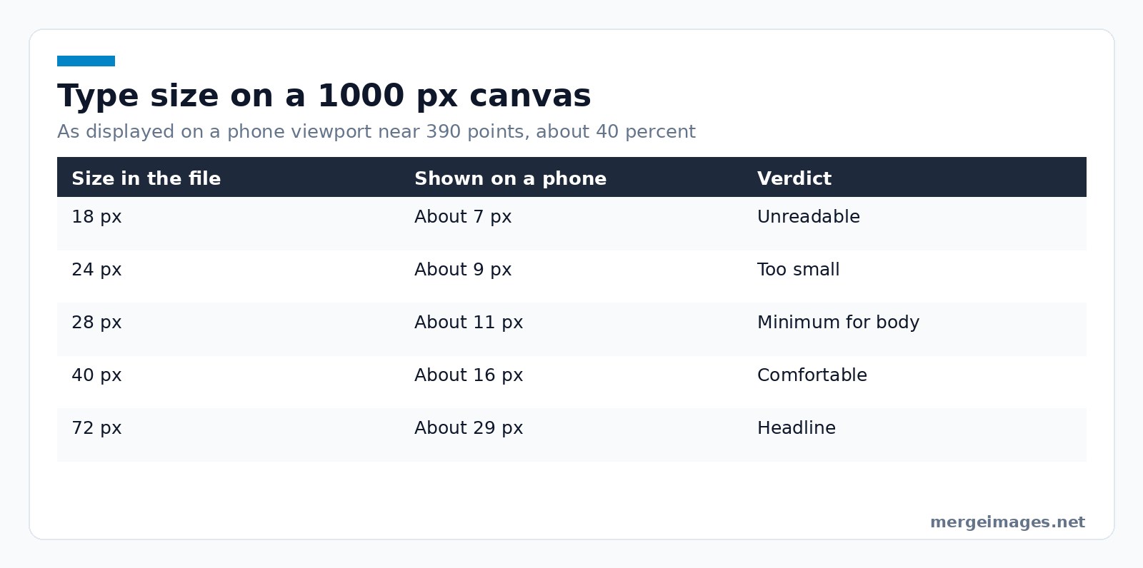
Type size is where most infographics lose. A 1000 pixel wide graphic shown on a phone viewport of around 390 points is being displayed at about 40 percent, so 24 pixel text in the file renders at roughly 9 pixels on the screen. Run the whole scale and it is bleak: 18 pixel type lands near 7, 28 near 11, 40 near 16, and a 72 pixel headline near 29. Set body copy at 28 pixels or more on a 1000 pixel canvas, labels no smaller than that, and check by shrinking the export to 40 percent on your own monitor.
Three to five colours, meaningful rather than decorative, and enough contrast that the graphic survives being viewed in sunlight.
Text Baked Into an Image Is Invisible
Here is the real limitation of the format, and it is worth understanding before you commit to it.
Text drawn into a raster image is not text any more. It is pixels. It cannot be selected, copied, translated by a browser, enlarged by a reader who needs larger type, or read aloud by a screen reader. The WCAG success criterion on images of text, a Level AA requirement, is explicit that where the technology can achieve the visual presentation, real text should be used rather than an image of text, with logos and customisable images as the exceptions. Its stated reason is plain: people cannot alter how text looks in images.
Search engines meet the same wall. Google's image documentation says alt text is the most important attribute for giving an image metadata, and that Google uses alt text together with computer vision and the contents of the page to work out what an image is about. Nothing in that pipeline is reading your carefully set 28 pixel body copy as page text.
So publish the infographic with the substance also present as real HTML: a proper alt description, and the key figures written into the surrounding article. That is not duplication, it is the only version of the graphic that a screen reader user, a translation tool or a search crawler can actually reach.
Data Integrity
Label the axes, start bar-chart axes at zero, and date every figure. If two panels use different scales, say so on the panels.
Cite the source of each number where it sits, not in a block at the bottom. A merged graphic gets cropped, screenshotted and reposted, and a source line attached to the panel survives that while a footer does not.
Platform Optimization
Pinterest is where infographics live longest, and its own guidance recommends a 2:3 ratio at 1000 by 1500 pixels, warning that Pins with an aspect ratio greater than 2:3 might get cut off in people's feeds. A 1000 by 4200 pixel graphic is about 1:4.2, so plan on Pinterest showing a fragment and make the top 1500 pixels work as a standalone teaser.
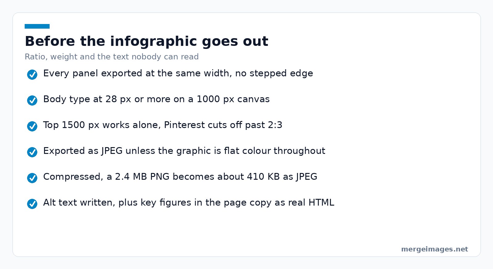
File size grows fast on a tall canvas. A 1000 by 4200 pixel graphic I exported as a PNG came out at 2.4 MB, and the same file as a JPEG at quality 82 was 410 KB with no visible difference in the type. Run the export through the image compressor before it goes on a page, since a multi-megabyte hero image is the fastest way to make an article feel slow.
For a web page, also serve the graphic at a sensible display width rather than dropping in the full-resolution file and letting the browser scale it.
Tools Integration
Charts from a spreadsheet, illustrations from a design tool, photographs from your own library, then assembly here. Chart tools are good at charts and bad at layout, and merge tools are the reverse.
Files you send to the merge, collage and compression tools are processed on our own servers, deleted automatically within 7 days, and never shared or used to train models.
Common Mistakes
- Type set for a desktop monitor and read on a phone
- Panels at mismatched widths, giving a stepped edge
- One graphic carrying five arguments instead of one
- No source lines, so nothing in it can be checked
- A 3 MB PNG on a page that then loads slowly
- No alt text, which leaves the entire content unreachable
Sharing and Impact
Post the full graphic where tall images are welcome and a cropped top section where they are not, and give every placement its own alt text. If the graphic earns links it will be because the data was worth citing, so make the numbers easy to quote in the article around it.
Frequently Asked Questions
What size should an infographic be?
Pick one width and stick to it. A 1000 pixel width works well across web and social, and Pinterest specifically recommends 1000 by 1500 pixels at a 2:3 ratio, warning that anything taller than 2:3 may be cut off in feeds. Height is dictated by content, but past about three times the width you should plan for platforms to show only the top of it.
How do I keep text readable in an infographic?
Design for the size people will actually see. A 1000 pixel graphic on a phone viewport near 390 points is displayed at roughly 40 percent, so 24 pixel type renders around 9 pixels. Keep body copy at 28 pixels or larger on a 1000 pixel canvas, then shrink your own export to 40 percent and read it before publishing. If you cannot, neither can your audience.
Is text inside an image bad for accessibility?
Yes. WCAG success criterion 1.4.5, a Level AA requirement, says real text should be used rather than images of text wherever the technology allows, because people cannot alter how text looks in an image. A screen reader gets nothing from baked-in words, and a reader who needs larger type cannot get it. Publish the key content as HTML alongside the graphic.
Why does my infographic file end up so large?
Tall canvases multiply quickly, and PNG stores photographic and gradient areas inefficiently. A 1000 by 4200 pixel graphic can easily exceed 2 MB as a PNG while landing near 400 KB as a good-quality JPEG. Use PNG only when the graphic is flat colour and sharp type throughout, otherwise export JPEG and compress it before publishing.
Can I edit the text after merging the panels?
No. Once panels are merged the output is a flat image and every word in it is pixels, so there are no layers to reopen. Fix typos and numbers at the individual panel stage, keep the source panels in a folder, and rebuild from those if something changes. This is the single most common reason people redo an infographic from scratch.
Where I Would Spend the Effort
Two places. Get the type size right for a phone, because that is where most of the audience is and it is invisible on your monitor. And write the substance out as real text on the page around the graphic, because that version is the one screen readers, translation tools and search crawlers can read. Everything else is craft you can improve next time.

Bello builds useful software and writes thoughtful content to make sense of it all. He tests the tools himself and checks the facts before any of it goes in a guide.
Try Our Free Image Tools
Ready to Try It?
Put these tips into practice with our free online image merger. No signup required.
Merge Images Now


