
Summarise this article with:
Color theory turns vague editing instincts into measurable choices. Match your hues. Shift temperature by exactly 200 K. Fine tune saturation. You build a portrait’s appeal or craft cinematic landscape tension without overprocessing. This discipline delivers consistent, natural looking images every single time you export. When a photo needs warming or cooling, the color temperature tool shifts it with a single slider, no editor required.
Stop Guessing on the Color Wheel The color wheel, a centuries old tool, becomes an editing compass when you map its logic onto digital controls. Complementary pairs such as orange and teal create visual tension that draws the eye. Analogous groups such as green yellow yellow produce harmony that lets the subject breathe. Split complementary mixes the excitement of contrast with the subtlety of harmony, making it ideal for nuanced looks.
Map the Wheel to the Scene
When you overlay a color wheel on a photograph, the dominant hues of the scene reveal immediate opportunities. A sunrise portrait may sit on the orange side. A cityscape at dusk may lean toward blue purple. Decide whether you want the image to feel calm, dramatic, or balanced. Then choose a relationship on the wheel. For a calm portrait, shift toward analogous warm tones. For a dramatic cityscape, amplify the complementary teal orange contrast. The choice follows a visual rule. It is no longer a guess.
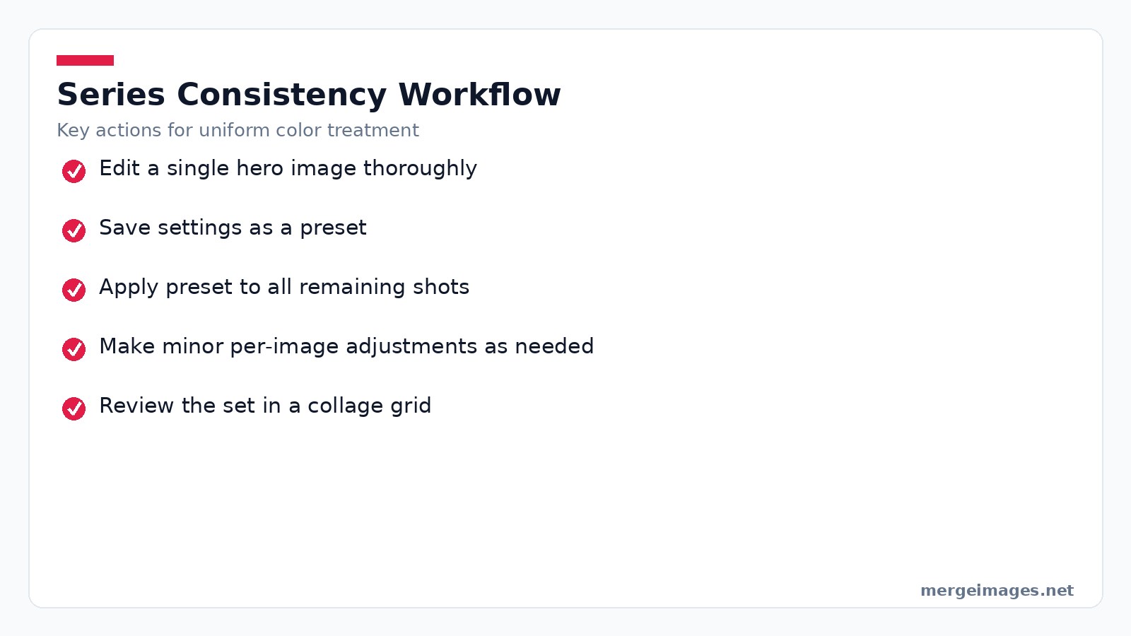
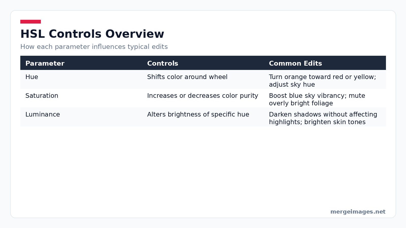

Photo: Miguel Á. Padriñán via Pexels
The Usual Mistakes
Many beginners apply a global saturation boost after setting white balance. The result is a washed out sky or an oversaturated skin tone because the adjustment ignores individual hue channels. Another common mistake is pushing temperature too far in one direction. This creates an artificial color cast. Recognizing these pitfalls early saves time and preserves image integrity.
Master HSL Sliders
Most editors expose Hue, Saturation, and Luminance as separate sliders. Hue moves a color around the wheel. Saturation adjusts its purity. Luminance changes its brightness. Because you can alter each channel independently, you avoid the bluntness of global sliders. Increase the Saturation of the blue sky by +20 while leaving the orange foliage untouched. The result feels natural because you respect each hue’s identity.
Respect the Data
HSL tools cannot create new colors missing from the original capture. If a shadow contains only muted blues, pushing Hue toward green will produce a desaturated, unrealistic tone. In such cases a selective color replacement tool or a targeted brush is required. Extreme Luminance moves can also reveal noise in low light areas. Apply noise reduction after the edit.
Command Temperature and White Balance
Temperature is measured in Kelvin. Lower numbers (2700 to 4000 K) add orange glow. Higher numbers (5500 to 7000 K) inject blue chill. The temperature tool shifts the whole image without altering individual hues. Use a modest +150 K boost on a cloudy portrait to restore a sunlit feel. Drop -200 K on a beach scene to emphasize the cool sea. White balance correction aims for neutrality. Temperature grading adds mood.
MergeImages Platform Walkthrough
On the MergeImages platform the temperature slider is located under the "Adjust" tab. After moving the slider, click the "Preview" button to see the effect before committing. If you need to apply the same offset to a batch, select multiple images, choose "Batch Edit," set the temperature value, and hit "Apply to All."
Split Tone with Intent
Split toning assigns one hue to shadows and another to highlights. A classic cinematic recipe places teal on shadows and orange on highlights, echoing the complementary relationship of the wheel. Start with a subtle 5 to 10 % saturation for shadows. Then add a slightly lower saturation orange to highlights. Adjust the Luminance sliders to keep the tonal balance in check. Small values keep the effect elegant. Larger values create a stylized look that may suit creative projects.
Check Exposure First
Applying split toning without first correcting exposure often deepens shadows too much. Details disappear. Always check histogram peaks before adding color to shadows. If the shadow detail is lost, raise the Luminance of the shadow hue rather than increasing its saturation.
Protect Portrait Skin Tones
Skin lives in the orange red band. Global saturation boosts can unintentionally wash out that nuance. Target the orange channel directly instead. A slight Hue shift toward yellow (+5) adds a flattering warmth. A modest Saturation increase (+8) preserves texture. If you need more contrast, use the brightness slider on the Luminance of the orange range rather than brightening the entire image. This protects the subtle blush and prevents a plastic appearance.
Mask Group Faces
When editing a group portrait, isolate each face with the "Mask" tool. Apply the orange channel adjustments individually. This avoids the situation where one subject ends up too warm while another looks too cool.
Tame Competing Landscape Hues
A mountain scene may contain blue sky, green foliage, and orange rock. When colors compete for attention, reduce the Saturation of the less important element. Perhaps you mute the orange rock to let the sky dominate. If you desire high drama, keep both sky and rock fully saturated. Let the complementary clash speak. For a tranquil feel, shift the palette toward analogous warm tones. Nudge the green hue toward yellow green and the sky toward soft teal.
Preserve Depth Cues
Over reducing saturation in a landscape can flatten depth cues that rely on color contrast. After any saturation change, review the depth perception by toggling the "Depth Map" overlay available in the advanced panel.
Design Product Backgrounds with Theory
When you remove a background with the background remover tool, you gain a blank canvas for color decisions. A complementary background like blue behind an orange gadget creates separation that draws the eye to the product. An analogous background like warm beige behind a brown leather bag yields a cohesive, upscale vibe. Neutral gray or white stays safe for color accurate ecommerce listings. After placing the new backdrop, fine tune the overall contrast with the contrast control to ensure the product pops without harsh edges.
Five Step Workflow
- Upload the product image.
- Click "Remove Background" and confirm the mask.
- Choose a new backdrop from the library or upload your own.
- Use the "Add Contrast" slider (found under "Enhance") to add a touch of pop. Typically +12 works well for glossy items.
- Save the edit as a preset for future products of the same line.
Lock Down Series Consistency
Series work demands uniform color treatment. Weddings, product lines, and portrait sessions all require it. Begin by editing a single "hero" image until every hue, temperature, and contrast feels right. Save those settings as a preset. Apply the preset to the remaining shots. After bulk application, make minor per image tweaks to accommodate lighting variations. Finally, assemble the images in a grid using the collage maker. The side by side view instantly reveals any stray temperature or saturation outliers.
Catch Light Drift
Even with a preset, variations in ambient light can cause a single image to drift toward a cooler cast. Use the "Auto-Match" feature in the series view to align the histogram of each new image to the hero image before applying the preset.
Frequently Asked Questions
Does color theory apply differently to black and white photography?
Yes. Without hue, you rely on luminance contrast. Adjusting the Luminance of original color channels changes how those tones render in gray, preserving the visual hierarchy the theory describes.
How can I match colors between photos shot under mixed lighting?
Start by correcting white balance on each image. Then use the same temperature offset (e.g., +180 K) across all shots. Fine tune individual hues with the HSL sliders to align the overall palette.
What is the difference between color correction and color grading?
Correction restores faithful reproduction. Neutral whites and accurate skin tones are the goal. Grading adds artistic color choices after correction, shaping mood rather than truth.
When should I use split-complementary instead of pure complementary?
Choose split complementary when you want visual interest without the harsh clash of direct opposites. It keeps the scene lively while maintaining a smoother overall feel.
Can I achieve these adjustments without a full-featured editor?
Absolutely. MergeImages offers single slider tools for temperature, brightness, and contrast that let you apply the same principles directly in the browser, no signup required.

Bello builds useful software and writes thoughtful content to make sense of it all. He tests the tools himself and checks the facts before any of it goes in a guide.
Try Our Free Image Tools
Ready to Try It?
Put these tips into practice with our free online image merger. No signup required.
Enhance your photos, free


