
Summarise this article with:
The Bottom Line
Carousels drive up to 3 times more saves than a single image post. They also pull swipe through rates between 20% and 30% when you give each slide a tight visual rhythm. You stop the scroll by packing depth into a multi frame format that rewards interaction.
The 2026 Algorithm Playbook
Instagram measures depth of interaction now. Every swipe counts as a separate engagement event. The algorithm sees a chain of swipes and flags your content for broader distribution. Each new slide you add creates a fresh chance for a like, a comment, or a save.

Sizing and Technical Specs
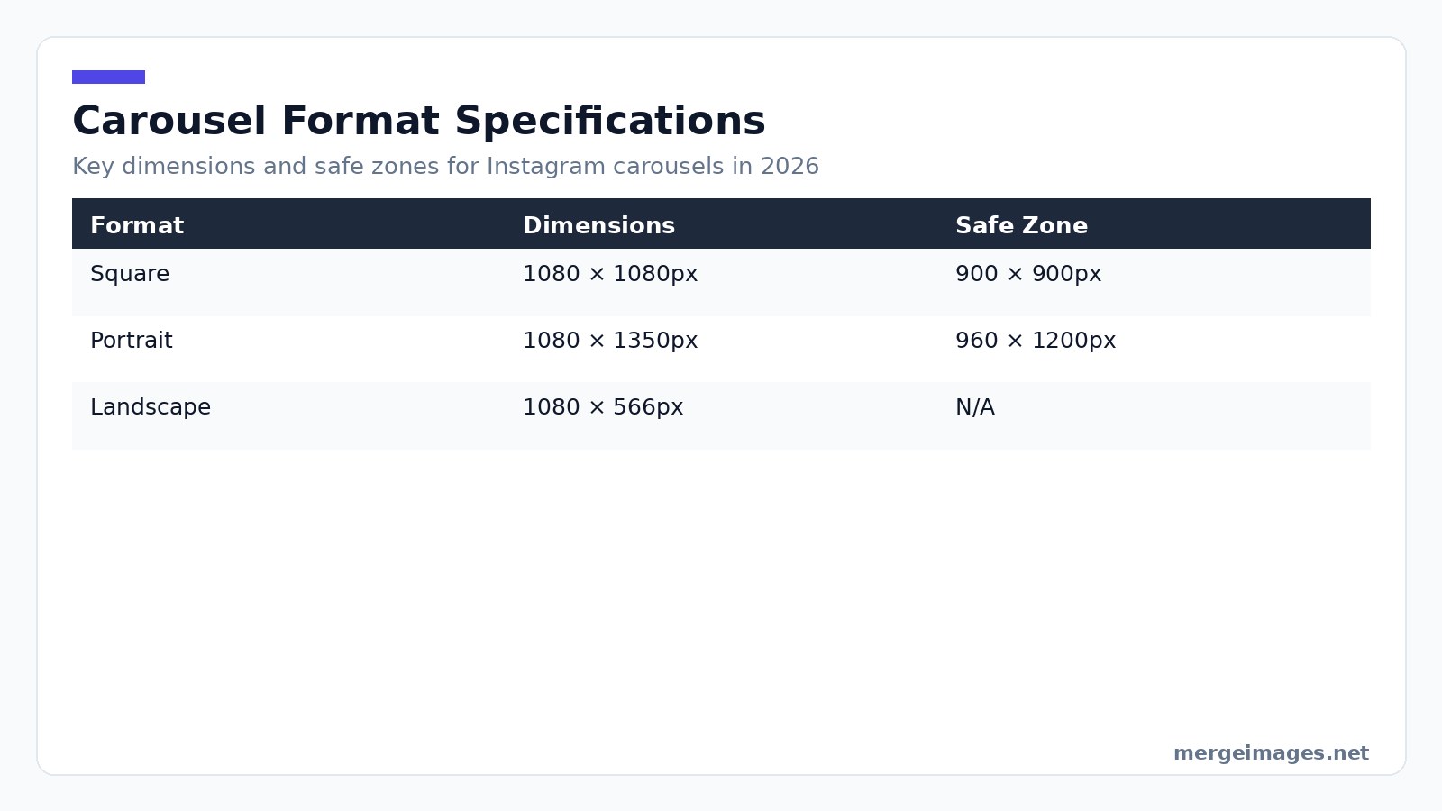
You have three main formats to choose from. Standard square carousels use 1080 × 1080px in a 1:1 ratio. Keep your key elements inside a 900 × 900px safe zone. You can upload up to 10 slides in JPEG under 8 MB or PNG.
Portrait carousels are the recommended choice for mobile. You get 1080 × 1350px in a 4:5 ratio with an inner 960 × 1200px safe zone. This format occupies roughly 56% more vertical space in the feed, increasing visual impact.
Landscape carousels use 1080 × 566px in a 1.91:1 ratio. Use them for panoramic shots or side by side product comparisons. The smaller visual footprint reduces scroll stop power, so proceed with caution.
When I need an exact pixel canvas, I open the image cropper, set the aspect ratio to 4:5, and the tool snaps the crop to 1080 × 1350px instantly. It guarantees the safe zone stays intact.
Formats That Actually Perform
Educational swipe for more carousels drive the highest save rates. Structure each slide around a single bite size insight. Start with a bold hook, deliver one point per slide, and finish with a clear call to action. Users treat this format as a reference guide.
Story carousels tell a narrative across slides. Let each image answer the previous question while raising the next. Behind the scenes processes, personal transformations, and brand origin tales thrive here.
Before and after carousels show a stark contrast between the first and second slide. For visual transformations like photo retouching, interior redesign, or fitness progress, pair the two images using the photo collage maker. You get a single slide collage that fits the carousel flow.
Product showcase carousels feature a hero shot. Follow it with detail views, lifestyle context, variant options, and a final pricing call to action. Consistency across these slides builds trust and keeps the viewer moving forward.
Designing the Cover Slide
Your first image does the heavy lifting. It appears in the grid, the feed, and the explore page. It must halt scrolling instantly. Use high contrast, a headline under ten words, and a visual that stands out from neighboring posts.
Keep your text guidelines strict. Use a minimum 60px type on a 1080px canvas. Keep the headline under ten words. Lead with a hook word like secret or mistake. Visually, a single high contrast element works better than a crowded composition. I once tried a multi object layout for a cover. The preview blended into the surrounding grid, causing a noticeable drop in swipe throughs.

Photo: Visual Tag Mx via Pexels
Mistakes and Honest Limits
- Overloading slides forces Instagram to split the carousel after ten slides, breaking narrative flow.
- Ignoring safe zones means text that touches the edge gets cropped on some devices, reducing readability.
- Inconsistent branding happens when you switch fonts or colors mid carousel, creating visual noise and lowering completion rates.
- Neglecting alt text strips the carousel of accessibility value and misses out on potential algorithmic credit.
- Relying on a single call to action feels spammy if repeated on every slide. Reserve a strong ask for the final slide.
Platform Guidance
Keep the first 125 characters of your caption compelling. Instagram truncates after that point in the feed. Use 5 to 7 highly relevant tags placed at the end of the caption to avoid clutter. Write a concise sentence for each slide in the alt text field. Describe the visual and any key text to improve accessibility and boost discoverability.
Align carousel drops with peak activity windows. Data from Insights typically shows spikes at 9 am to 11 am and 6 pm to 8 pm in the user local time zone. Cross promote by sharing a teaser Reel that flips through the first three slides. This drives Reel viewers to the carousel and leverages the multi format algorithm boost.
Slide Consistency
A carousel that jumps between fonts, colors, and layouts feels like a hastily assembled slide deck. Consistency signals professionalism and helps the viewer focus on the message. Build a reusable template. Create a base file with fixed background colors, heading style, body text style, and margin guides. Fill in new content each time and the visual system stays uniform without extra effort.
Limit your color palette to a primary, a secondary, and a neutral tone. Too many accent colors create visual noise and dilute brand recognition. Pick one heading font and one body font. Stick with them throughout the carousel. Switching fonts midway distracts the audience.
Transitions and the Peek Technique
For portrait carousels, extend a graphic element slightly off the right edge of each slide. The viewer sees only a sliver of the next visual. This prompts a swipe to complete the picture. The technique works on every slide, not just the first, to maintain momentum.
Calls to Action That Work
The final slide should ask for a single, specific action. Asking users to save the post works because saves carry high algorithm weight. Asking them to comment yes if they agree drives comments. Asking them to share with a friend who needs it expands reach beyond your follower base.
Versus TikTok Photo Carousels
TikTok favors rapid, audio driven sequences. Instagram rewards clear, text heavy educational structures. Align your carousel strategy with the platform. Instagram leans on strong hooks and readable typography. TikTok leans on kinetic visual flow.
Analytics and Metrics
Instagram native insights omit slide by slide data. Third party dashboards can reveal drop off points and swipe through rates. Aim for a swipe through rate above 20% and a save rate above 2%. Those numbers indicate the carousel is resonating.
Frequently Asked Questions
How many slides should a carousel have?
Educational pieces work best with six to ten slides, each delivering one clear point. Story driven carousels follow the narrative length, but trimming excess slides always improves completion rates.
Should I design carousels as square or portrait?
Portrait generally wins because it consumes more vertical space, making it harder to scroll past. Square fits a tidy grid aesthetic, so choose based on overall feed harmony.
Can I reuse carousels across Instagram and LinkedIn?
Yes, with minor tweaks. LinkedIn expects PDF uploads and a more formal tone, so adjust the cover slide headline and call to action accordingly while keeping the core visuals.
What's the best time to post a carousel?
Check your Instagram Insights for peak activity windows. Typically, mid morning between 8 am and 10 am and early evening from 6 pm to 8 pm capture the largest active audience.
How do I ensure my text stays within the safe zone?
Use the image cropper to define a custom canvas. Set the crop dimensions to the safe zone size (for portrait, 960 × 1200px) and the tool will display a guide that prevents overflow.
Tool Recap
Use the photo collage maker to combine multiple product angles into a single slide. The image cropper enforces safe zone dimensions instantly. The image resizer adjusts any slide to exact pixel sizes for flawless uploads.
Craft each carousel with purpose. Keep the visual language tight. Let the algorithm reward your depth. You will get more swipes, more saves, and a wider reach for every post you share.

Bello builds useful software and writes thoughtful content to make sense of it all. He tests the tools himself and checks the facts before any of it goes in a guide.
Try Our Free Image Tools
Ready to Try It?
Put these tips into practice with our free online image merger. No signup required.
Make your social images, free


