
Summarise this article with:
Your podcast cover art is the thumbnail that appears in Spotify searches, Apple Podcasts browse listings, and every app directory where your show lives. It's the first image a potential new listener sees before they've heard a single second of audio. Poor cover art doesn't just look unprofessional, it actively loses listeners who make quick visual judgments while scrolling a results page. This guide covers the specifications and design principles you need to create cover art that competes with professional podcasts.
Podcast Cover Art Specifications
Here's the detail that makes the spec table simpler than it looks: you upload one image to your podcast host (Buzzsprout, Transistor, Spotify for Creators, and so on), and that single file is pulled from your RSS feed into every directory. You do not submit different art to Apple, Spotify, and YouTube Music separately. One file has to satisfy the strictest requirement, and that requirement comes from Apple Podcasts, the de facto industry standard.
| Platform | Min Size | Recommended | Format | Shape |
|---|---|---|---|---|
| Apple Podcasts | 1400 × 1400 px | 3000 × 3000 px | JPG, PNG | Square |
| Spotify | 1400 × 1400 px | 3000 × 3000 px | JPG, PNG | Square |
| YouTube Music | 1400 × 1400 px | 3000 × 3000 px | JPG, PNG | Square |
| Amazon Music | 1400 × 1400 px | 3000 × 3000 px | JPG, PNG | Square |
| Pocket Casts | 1400 × 1400 px | 3000 × 3000 px | JPG, PNG | Square |
(Note: Google Podcasts shut down in 2024 and its listeners were migrated to YouTube Music, so YouTube Music is now the directory that inherits Google's old audience. The numbers are identical across the board because every platform reads from the same Apple-derived baseline.)
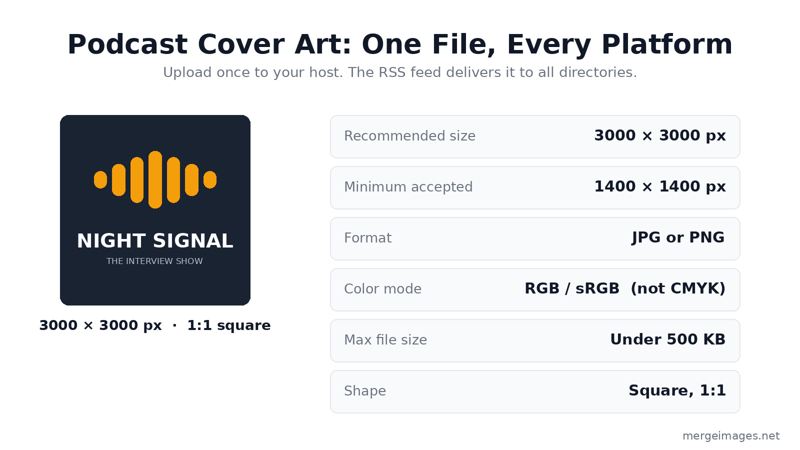
The practical standard: Design at 3000 × 3000 px, export as JPG (RGB color, 90% quality), and keep the file under 500 KB. Apple Podcasts rejects artwork over 500 KB, so that is the cap to design against, not a soft target. JPG at 80 to 90% quality almost always clears it without visible loss. This single file meets every major platform's requirements and future-proofs you against any platform that raises its standard later.
The 3000 × 3000 px size matters because your cover renders at wildly different sizes across contexts, from a large show page down to an 80 px notification badge. Starting at full resolution keeps it sharp everywhere.
What Makes Good Podcast Cover Art
Cover art appears across a huge range of display sizes:
- 3000 × 3000 px on desktop show pages and smart-TV/car-dashboard displays
- 150 to 300 px in search results and show listings
- 55 to 80 px in notification banners, lock-screen players, and smartwatch faces
Your design has to read clearly at all of these sizes at once. That single constraint drives most of the decisions below.
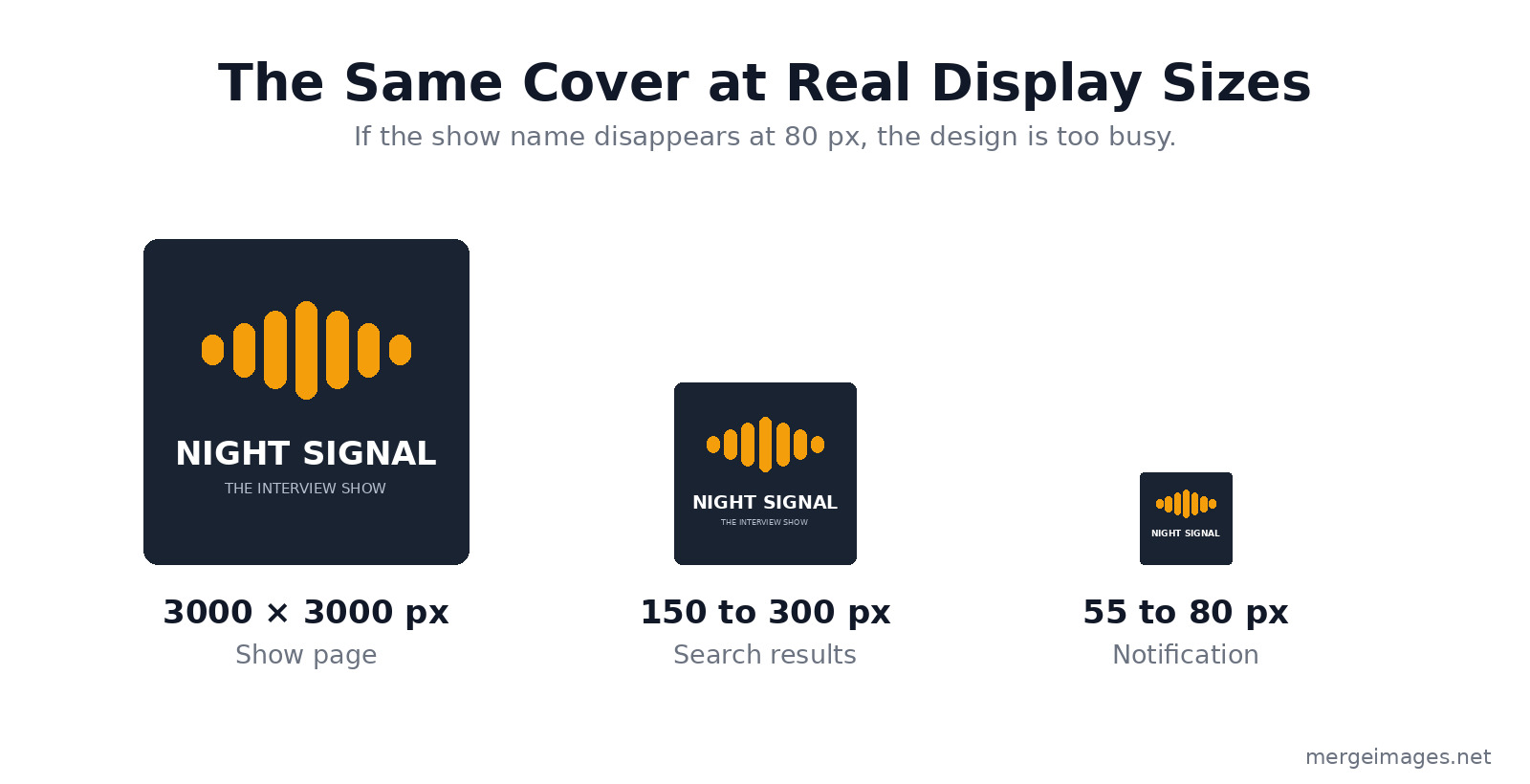
The trap is designing on a 3000 px canvas where everything looks great, then discovering the title is illegible at 80 px. Shrink your draft to thumbnail size before you commit. If you can't read the show name in the smallest preview above, the design is too busy.
Bold, Legible Typography
If your show name appears on the cover (and it usually should), the text has to survive at roughly 80 pixels wide. That means:
- Maximum 1 to 2 lines of text
- A large font size that takes up vertical space generously
- High contrast between text and background
- Simple, bold typefaces over decorative or script fonts
Sans-serif fonts like Montserrat Bold, Oswald, and Bebas Neue outperform serif fonts at small sizes. Serif details turn into visual noise below 100 px. Test your typography at thumbnail size before finalizing.
A Single Strong Visual Concept
The best podcast cover art has one visual idea that makes it instantly recognizable in a crowded results page:
- A distinctive primary color that stands out in your genre
- One strong image, illustration, or graphic element, not several competing ones
- Minimal complexity, where every element earns its place
When a listener scrolls through 20 search results, your cover has under a second to catch the eye. Simplicity is the most effective differentiator you have.
Photography vs. Illustration
Photography works when:
- Your face is part of the show's brand (interview shows, personal brands, solo hosts)
- The photo has a clear focal point and works as a tight square crop
- The image quality is high and the lighting is good
Illustration works when:
- Your show covers abstract or conceptual topics
- You want a scalable look that holds up at any size
- You don't have a strong photography option
If you use a face photo, make it fill the frame confidently. Tiny faces surrounded by empty space look hesitant at thumbnail size. Use the image resizer to crop tight to the face while preserving the 1:1 square format.
Color Strategy for Podcast Cover Art
Color is the most immediate visual cue in podcast directories. Browse any category in Apple Podcasts and you'll notice the most recognizable shows lean on a distinctive primary color. Red dominates news and commentary. Dark, desaturated palettes pervade true crime. Bright, optimistic palettes show up in wellness and self-help.
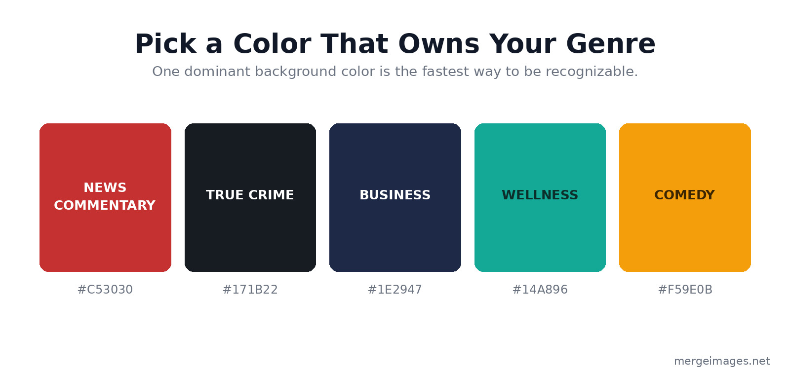
Practical approach:
- Choose one dominant background color that's distinctive in your genre
- Use white or another high-contrast color for your text
- Add one accent color sparingly for graphic elements or highlights
A clean background with your show name in bold white text and one strong graphic element usually beats elaborate design. The background remover can isolate a portrait from a busy background so you can drop it onto a clean, branded solid color.
Typography Best Practices
Top vs. bottom text placement. In most podcast app interfaces, the cover art appears with the show name printed below it in the listing. Placing your show name at the top of the cover puts it in the most prominent position for the moments when only the cover is visible, like notifications, lock-screen players, and watch faces.
Limit the word count. The show name plus maybe one descriptor word is the most that reads well at small sizes. Your description and episode details live in the listing text, so the cover only needs to carry the name.
Contrast check. Check the contrast ratio between your text and background. A minimum of 4.5:1 keeps the text legible across different screen brightness settings and in direct sunlight on a phone.
Preparing Your File for Submission
Once your design is complete:
- Export at 3000 × 3000 px
- Use JPG format at 90% quality (PNG is fine for flat graphics and logos)
- Use RGB color mode, not CMYK, which is for print and renders wrong on screens
- Confirm the file size is under 500 KB
- View the file at 80 × 80 px to confirm the text and visuals stay legible
For the final compression step, the image compressor can shrink the file while preserving visual quality, which helps when your export lands just over the 500 KB ceiling.
For how cover art standards line up with other creator content, see our guides on YouTube channel art sizes and design, the album cover art specs for Spotify and Apple Music, and the social media image sizes cheat sheet.
Updating Your Cover Art
Unlike a book cover, podcast cover art can be changed at any time. If your current cover is underperforming or your show has evolved, a visual rebrand is straightforward:
- Design the new cover at 3000 × 3000 px
- Upload it in your podcast hosting dashboard, which updates your RSS feed
- Most platforms pull the new art within 24 to 48 hours (Apple Podcasts can take up to a week)
- In Apple Podcasts Connect, submit a manual refresh if you need faster propagation
Genre Design Conventions Worth Knowing
Browse the top podcasts in your genre to learn its visual conventions before you design:
- True crime: Dark backgrounds, high-contrast typography, moody imagery
- Business/entrepreneurship: Clean and minimal, with navy or dark backgrounds dominant
- Comedy: Bright colors, informal typography, a photo of the host or hosts
- Health/wellness: Fresh, optimistic palettes (soft warm tones or clean teals and greens), natural imagery or clean illustration
- Technology: Dark backgrounds, geometric design elements, tech-adjacent imagery
Knowing the conventions lets you fit in where that's useful and stand out where differentiation matters more.
Frequently Asked Questions
What size should podcast cover art be?
Design at 3000 × 3000 px square. The minimum accepted by Apple Podcasts and Spotify is 1400 × 1400 px, but 3000 × 3000 px keeps it sharp across every context, including the large displays on smart TVs and car dashboards.
Should podcast cover art be JPG or PNG?
Both are widely accepted. JPG at 90% quality produces smaller files while holding visual quality, which makes it easier to stay under the 500 KB limit. PNG is preferable when your design is flat color or has sharp logo edges, where lossless compression looks cleaner.
How do I make my podcast cover art stand out in search results?
Bold typography, a distinctive primary color, and a single clear focal point. Browse your genre's top shows, spot the common visual patterns, then pick one deliberate way to differentiate within those conventions.
Can I use a photo of myself as podcast cover art?
Yes, and for personal-brand or interview-style shows a confident portrait often performs well. Crop tight so your face fills most of the square, add bold text for the show name, and make sure the photo is well lit and high resolution.
What is the maximum file size for podcast cover art?
Apple Podcasts caps artwork at 500 KB and rejects anything larger, so that is the limit to design against. Build at 3000 × 3000 px but export with enough JPG compression to land under 500 KB. Use the image compressor if your exported file comes out too large.
Conclusion
Podcast cover art is your show's permanent ambassador across every search result, recommendation, and listener notification. Design at 3000 × 3000 px, use bold typography that reads at 80 px, choose a distinctive color for your genre, and keep the composition simple. Test at small sizes before you finalize. Use the image resizer for exact dimensions, the background remover for clean photo compositing, and the image compressor for final file size optimization. First impressions are permanent, and in podcast directories your cover is the first and sometimes only impression you get.

Bello builds useful software and writes thoughtful content to make sense of it all. He tests the tools himself and checks the facts before any of it goes in a guide.
Probieren Sie Unsere Kostenlosen Bildtools
Bereit es Auszuprobieren?
Setzen Sie diese Tipps mit unserem kostenlosen Online-Bildeditor in die Praxis um. Keine Anmeldung erforderlich.
Design your visuals, free


