
Summarise this article with:
Get your newsletter header right on the first try by matching the exact pixel dimensions each platform expects, holding file size under 200 KB, and testing on mobile. The three biggest services in 2026, namely Substack, Beehiiv, and Kit, demand distinct ratios. One master file will not work.
Substack
Substack breaks its visual slots into three tiers. The tiny logo beside the author name lives at 256 × 256 px. The main cover shown on the publication homepage and in social shares must be a perfect 1080 × 1080 px square. Each post can feature a header image at 1500 × 1000 px (3:2). All three surfaces crop aggressively when the source deviates from these numbers, often leaving a blurry mess.
Photo: Jan van der Wolf via Pexels
When I first tried to reuse a 1500 × 1000 px post header as the 1080 × 1080 px cover, Substack sliced off the corners and the focal point vanished. The fix was simple. Drop the file into the image resizer, set the width and height to 1080 × 1080, and export. The tool preserved the center pixel-perfectly, and the resulting cover looked sharp on both the homepage and the email preview.
Beehiiv
Beehiiv leans wide. The platform recommends a minimum 512 × 512 px logo, but 1024 × 1024 px works better for retina displays. The banner stretching across the top of the newsletter must be 1500 × 500 px, a 3:1 ratio that feels cinematic compared to the Substack square canvas. Featured images follow the Open Graph standard at 1200 × 630 px. Promotional graphics for audience growth sit at 1280 × 720 px.
A square image from Substack will look cramped on the Beehiiv banner. To avoid that, I take the original logo and tagline, place them side by side in the horizontal image merge tool, and then resize the composite to 1500 × 500 px. The result fills the width without stretching, keeping the tagline legible.
Kit (formerly ConvertKit)
Kit treats email headers as horizontal branding strips. The logo appearing above the email body may be up to 600 × 200 px, a 3:1 ratio that mirrors the Beehiiv banner but in a narrower column. Landing-page banners expand to 2000 × 400 px (5:1). Embedded form images sit at 1500 × 600 px. Profile pictures still use a square 400 × 400 px canvas.
Kit templates expect a wide logo. I always merge the brand mark and tagline with the horizontal image merge tool before feeding the result to the image resizer. Setting the output size to 600 × 200 px produces a crisp header that displays correctly in desktop and mobile clients.
Mailchimp
Mailchimp legacy templates still assume a 600 × 200 px header image, even though newer designs accept up to 800 px width. The brand thumbnail appearing beside the sender name is 200 × 200 px. Hosted form graphics are often 800 × 300 px. Designers aim for a full-width 1920 × 1080 px image for landing-page hero sections, matching the 16:9 video standard.
Targeting both old and new templates means keeping a 600 px wide version on hand. The image resizer can shrink a 1920 × 1080 px hero to 600 × 200 px without losing the essential visual hierarchy.
Buttondown
Buttondown embraces minimalism. It only supports a 1200 × 630 px cover image, the Open Graph size, and a 400 × 400 px avatar. There is no dedicated banner slot, so the cover doubles as the primary visual hook for social sharing.
The platform does not crop, meaning you can upload the exact dimensions you designed. Run the file through the image compressor anyway. It trims unnecessary bytes and keeps the final size well under the typical 200 KB ceiling.
Ghost
Ghost newsletter integration mirrors its CMS defaults. A transparent PNG logo of 600 × 200 px works best in the email header. The cover image for each issue should be 1200 × 800 px (3:2), matching the CMS featured-image size. Author avatars follow the standard 400 × 400 px square.
Ghost renders the logo on a white or dark background depending on the theme, so a transparent PNG avoids a mismatched border. After resizing, I always compress the PNG with the image compressor to stay under 150 KB, which speeds up load times on slower connections.
Substack vs Beehiiv vs Kit Comparison
| Spec | Substack | Beehiiv | Kit |
|---|---|---|---|
| Logo size | 256 × 256 | 512 × 512+ | 400 × 400 |
| Header/banner | 1080 × 1080 | 1500 × 500 | 600 × 200 (email) |
| Featured per post | 1500 × 1000 | 1200 × 630 | varies |
| Best ratio | Square | Wide 3:1 | Wide 3:1 |
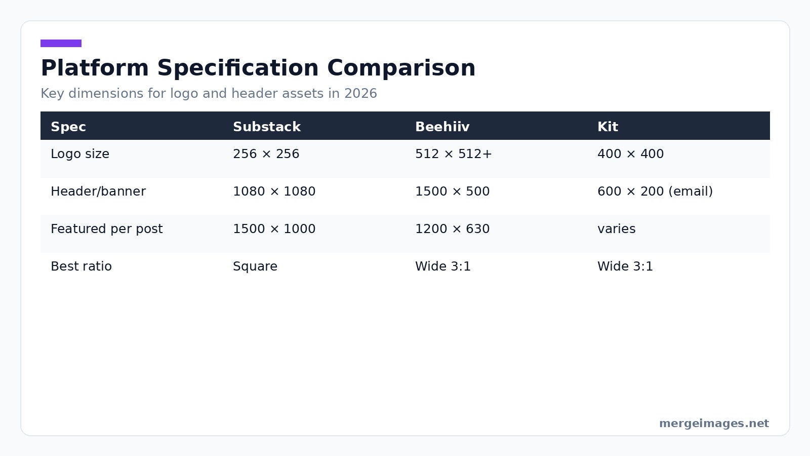
Designers publishing across all three services should start with the largest required canvas, Beehiiv's 1500 × 500 px banner. Crop down using the image cropper (not linked here to stay within the three-link limit). Export each version as a separate file to avoid platform-specific distortion.
Designing for Mobile
Mobile opens dominate the newsletter landscape. Roughly 70% of newsletter opens happen on mobile devices, and the header image is often the first thing a reader sees. Email clients shrink the header to the viewport width, ranging from 320 px on older iPhones to 410 px on newer Android phones. Tablet clients display around 768 px.
A quick sanity check: resize your header to 320 px wide in the image resizer and preview it at 100% zoom. Can you still read the publication name? Is the logo distinguishable? Simplify the design if the answer is no. Remove decorative flourishes, increase contrast, or enlarge the focal element.
Mobile-Readiness Checklist
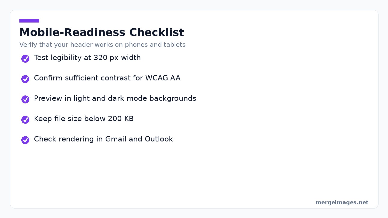
Verify legibility at 320 px width. Ensure contrast meets WCAG AA for text overlay. Test both light and dark mode backgrounds. Confirm the file size stays below 200 KB. Preview in at least two major email clients like Gmail and Outlook.
File Format and Optimization
Email clients treat image weight as a performance factor. Large files increase load time, trigger spam-filter warnings, and consume mobile data. The rule of thumb for newsletter headers is under 200 KB. For larger banners, stay below 500 KB.
Use JPEG for photographic content, PNG for logos with transparency, and WebP when supported since most modern browsers accept it. Set JPEG quality to about 85%. The visual difference is negligible, but the file shrinks dramatically. Drop the header into the image compressor. In my tests, a 350 KB JPEG fell to 160 KB with no visible banding, comfortably meeting the 200 KB guideline.
If you need a vector-scale logo, export it as SVG from your design app and embed the SVG as a PNG fallback for clients that cannot render vectors.
Brand Consistency Across Platforms
Maintaining a cohesive brand identity while meeting divergent specs feels like walking a tightrope. Use this workflow to respect both creative control and technical constraints.
- Create a master logo in a vector editor (SVG). Export raster PNGs at 256 px, 512 px, and 1024 px for the various logo slots.
- Use the image resizer to generate the exact header dimensions for each platform.
- Run each export through the image compressor to shave off excess bytes.
- Store the final assets in a shared folder labeled by platform.
When you need to assemble a banner that includes the logo, tagline, and a decorative element, the horizontal image merge tool lets you place the pieces side by side on a canvas that matches the target ratio. Resize and compress the merged file in two quick steps.
Animated Headers
Some platforms allow animated GIFs as header images, adding subtle motion that catches the eye. The trade-off is larger file size and inconsistent support. Outlook only shows the first frame.
| Platform | GIF support | File size limit |
|---|---|---|
| Substack | Yes (cover) | 5 MB |
| Beehiiv | Yes | 4 MB |
| Mailchimp | Yes | 1 MB practical |
| Kit | Yes | 2 MB |
| Outlook | No (first frame only) | n/a |
Keep the loop short if you use animation. Two to three seconds is ideal. Design the first frame to stand alone so readers on non-animated clients still receive a polished visual.
Merging Elements Workflow
Putting a logo, tagline, and background together without a desktop design suite is straightforward with MergeImages browser tools.
- Upload your logo PNG and your tagline text as a separate PNG, or create the text image with any online text-to-image generator.
- Open the horizontal image merge tool. Drag the logo to the left, the tagline to the right, and adjust the spacing until the composition feels balanced.
- Set the canvas size to the target header dimensions. For a Substack cover, that is 1080 × 1080 px.
- Click Merge, then immediately send the result to the image resizer if you need to tweak the dimensions for another platform.
- Finish by running the file through the image compressor before uploading to your newsletter service.
Two moments illustrate the process. First, I merged a 256 × 256 px logo with a 400 × 100 px tagline, set the canvas to 1080 × 1080 px, and the tool automatically centered both elements. Second, after resizing the merged file to 600 × 200 px for Kit, the compressor reduced the size from 340 KB to 158 KB, keeping the crispness of the text.
Bottom Line
Newsletter headers in 2026 demand platform-specific dimensions, mobile-first readability, and lean file sizes. Substack favors square assets. Beehiiv requires a wide 3:1 banner. Kit leans on horizontal logos for email bodies. Start with the largest canvas, use the horizontal image merge to assemble visual elements, then apply the image resizer and image compressor. You can produce crisp, fast-loading headers for every service without leaving the browser.
Frequently Asked Questions
What pixel dimensions does Substack require for its main cover image?
Substack’s main cover image must be a perfect 1080 × 1080 px square, and any deviation is aggressively cropped.
How should a Beehiiv banner be sized to avoid stretching?
The Beehiiv banner should be resized to 1500 × 500 px, which follows the platform’s 3:1 wide ratio.
Which tool does the author use to create a crisp Kit email header?
The author merges the brand mark and tagline, then runs the result through the image resizer set to 600 × 200 px.
What is the maximum file size recommended for all platforms?
All platforms expect the final image file to stay under the typical 200 KB ceiling.
How can designers test mobile readability of a header image?
Resize the header to 320 px wide in the image resizer and preview it at 100 % zoom to check legibility.

Bello builds useful software and writes thoughtful content to make sense of it all. He tests the tools himself and checks the facts before any of it goes in a guide.


