
Summarise this article with:
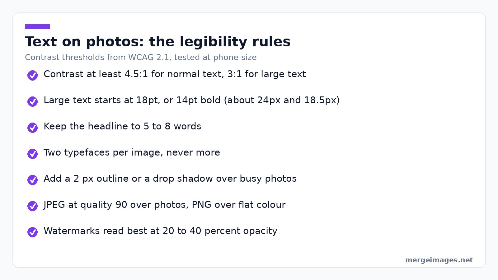
Adding text to a photo online takes about thirty seconds: upload, type, then make it readable. Readability is the whole job. WCAG asks for a contrast ratio of at least 4.5:1 for normal text and 3:1 for large text, which starts at 18pt or 14pt bold, and over a busy photo you reach that with an outline or a shadow rather than a bigger font.
Text turns a picture into a message. Captions, watermarks, callouts and thumbnails all do the same job: they tell the viewer what to think before the photo has finished loading in their head. This guide covers the free ways to do it, and the parts that decide whether the result stays legible on a phone.
Type It Straight Onto the Photo
The shortest path is a single-purpose tool. Open Add Text to Image, drop in your photo, type, drag it into place. No install, no account, no watermark on the output. Four things about how it behaves are worth knowing:
- Font size is relative, not absolute. The slider runs 12 to 120, and the number is a share of the photo's shorter side, not a pixel height. On a 1080 x 1350 portrait the default of 48 renders type roughly 518 px tall, and even the minimum of 12 gives about 130 px. This is a tool for headline text, not fine print.
- Outline and shadow are on by default, outline at 2 and shadow at a blur of 8, which is why white text stays legible over a bright sky. Outline adjusts from 0 to 10.
- Layers stack, and opacity drops to 10 percent. Add a second layer for a subtitle rather than forcing a line break.
- Five typefaces: Arial, Times New Roman, Courier New, Impact and Georgia. That is the list, with no font upload, so a licensed brand face means going elsewhere.
Export as PNG, or JPEG with a quality slider that starts at 90.
Why Add Text to Photos?
Text does work the image cannot. A photo of a room shows a room; the same photo with a price across the corner shows a price. A product shot shows a product; a callout shows the feature you want noticed.
Photo: Karolina Grabowska www.kaboompics.com via Pexels
The honest case is narrow: on-image text is read before the caption underneath, survives being screenshotted, and works in feeds where nobody clicks through. It is not a magic engagement multiplier, whatever round numbers marketing blogs quote. Badly set text performs worse than none, because it reads as noise.
Typography Best Practices for Photos
Readability is the whole thing
The common failure is text that looks good in the editor and vanishes on a phone.
Use real contrast. The W3C's contrast requirement is a ratio of at least 4.5:1 between text and background for normal text, and 3:1 for large text, where large means 18pt or 14pt bold (roughly 24px and 18.5px). A photo caption is harder than a web page, because the background changes behind every letter. White text over a bright sky fails it everywhere the cloud is.
Fix contrast with an edge, not a size. A 2 px outline, a drop shadow or a solid box behind the text all buy contrast without enlarging the type. Going bigger just fails larger.
Choose weight over decoration. Bold sans-serif holds up small; thin and script faces disappear at the sizes people actually view images.
Keep it to 5 to 8 words, because on-image text is a headline and a paragraph belongs in the caption field. Keep type off the subject's face and out of the corners where platform UI overlays it.
Text hierarchy
Primary text goes large and bold in the focal area, secondary text smaller beside it, a call to action in a contrasting colour. Two typefaces per image is the ceiling.
Choosing PNG or JPEG for Text
Format choice does more damage than font choice, and almost nobody thinks about it.
JPEG compresses in blocks and discards colour detail before brightness detail. Glyph edges are the worst possible input: a hard black-to-white transition inside one block produces ringing, seen as a faint halo or speckle around every letter, and saturated text on flat colour looks worst because the colour channel is the one being thinned.
PNG is lossless, so glyph edges stay as drawn, and it is the only one with real transparency. The cost is file size on photographs, often several times a JPEG. The rule that holds up:
- Text over a photograph: JPEG at quality 90 or above; photo grain hides the artefacts.
- Text over flat colour or a screenshot: PNG, because every artefact shows against flat areas.
- Anything needing transparency: PNG.
- Anything on a web page: export by the rule above, then run it through the Image Compressor rather than dropping JPEG quality to 60 and hoping.
Method 1: Canva (Best for Templates)
Canva is the fastest route to something that looks professionally laid out, because you start from someone else's layout rather than a blank photo. It wins outright on templates, brand kits, curved and effect text, and mobile apps.
Where it costs you: it needs an account, and parts of the asset library are gated behind the paid plan.
Method 2: Pixlr X (Best for Quick Edits)
Pixlr X sits between a one-purpose tool and a full editor. Open the image, hit the text tool, click where the text goes, set font, size, alignment and colour, and use the background option when the photo underneath is busy. More control, none of the ceremony of a template gallery.
Method 3: Photopea (Best for Advanced Typography)
Photopea is a Photoshop-shaped editor that runs in a tab: real type tools, Google Fonts plus custom font upload, layer effects, and blend modes so type sits inside the image rather than on it. If you need type on a curve, a licensed font, or a specific layer effect, this is the honest recommendation and not us.
Method 4: Merge Images + Text Overlays
Labelling a comparison is a two-pass job. Add the label to each photo separately with the text tool above, then join them with Combine Photos Online, setting the gap so the sides read as separate panels.
The order matters: labelling after the merge means placing text inside one half of a wide image, while labelling first positions each label against its own photo. It works for before and after pairs, feature callouts and numbered tutorial steps, and for multi-panel memes the Meme Generator handles it directly.
Adding Watermarks to Protect Your Photos
A watermark is a legibility problem in reverse: noticed, not distracting.
- Semi-transparent, 20 to 40 percent. Enough to read, not enough to compete with the photo.
- Placed where a crop would hurt. A corner mark comes off in one crop; something crossing the subject does not.
- The same every time, because consistent position, size and opacity is what turns a mark into recognition.
- Carrying a handle or a domain, so an honest reuser can ask.
Add Watermark is the direct route. Keep an unwatermarked master either way, because the mark is baked into the pixels and there is no undo.
Platform-Specific Text Guidelines
Verified against the platforms' own documentation, because these numbers move and most guides copy each other.
- Pinterest recommends 2:3, or 1000 x 1500 pixels, for a standard Pin, capping uploads at 20 MB from desktop and 32 MB in-app (Pinterest product specs). The tall format means text at the top survives the feed crop.
- YouTube thumbnails should be 16:9 at 3840 x 2160, minimum width 640 pixels, as JPG, GIF or PNG, under 2 MB from mobile or 50 MB from desktop (YouTube's own requirements). Three to five words with a heavy outline is what survives at a fraction of that size.
- Everywhere else, the real test is not a pixel spec. Export it, open it on your phone, hold it at arm's length. If you cannot read it, no dimension chart will save it.
Quick Reference: Text on Photos Checklist
- Readable at the size it will actually be viewed
- Contrast reaches 4.5:1, or 3:1 for large type
- Two typefaces at most
- Type avoids the subject's face and the edges where platform UI sits
- Headline is 5 to 8 words
- Spelling checked, because it is baked into the pixels
- JPEG over photos, PNG over flat colour
- Compressed before upload
Frequently Asked Questions
How do I add text to a photo for free without downloading anything?
Open a browser-based text tool, upload the photo, type, position it, download. The add-text tool needs no account and puts no watermark on the result. Set an outline or shadow before you export, because that is what keeps white text readable when the photo underneath changes brightness.
What font size should text be on a photo?
Size the type against the image rather than in absolute pixels, because the same photo is displayed at wildly different sizes. A headline usually occupies 20 to 30 percent of the frame's shorter side, a caption or credit line nearer 10 percent. Then check it at the size people will really see.
How do I make text readable over a busy photo?
Three fixes, best first: a solid or semi-transparent box behind the text, a 2 to 4 px outline in the opposite colour, then a drop shadow. A dark overlay across the image works too and costs you some of the photo. Making the font bigger does not fix contrast, it fails at a bigger size.
Should I save my text image as PNG or JPEG?
JPEG at quality 90 or above when the text sits over a photograph, because grain hides the artefacts. PNG when it sits over flat colour, a screenshot or a solid box, and always when you need transparency. PNG photographs are several times larger, so compress before uploading either one.
Will text added to an image be readable by search engines?
No. Text drawn onto a photo becomes pixels, so screen readers cannot read it and search engines cannot index it. Anything that matters for accessibility or search belongs in the alt text, the caption or the page copy too. Treat on-image text as a visual layer, never the only copy.
Conclusion
Start with readability and the rest is polish. Set contrast first, keep the headline to a handful of words, pick the format that matches what sits behind the letters, and check at the size people will really see. For a caption or a watermark, Add Text to Image does it in a tab. For curved type, a licensed font or a layer effect, Photopea is the better tool and free too.

Bello builds useful software and writes thoughtful content to make sense of it all. He tests the tools himself and checks the facts before any of it goes in a guide.
Probieren Sie Unsere Kostenlosen Bildtools
Bereit es Auszuprobieren?
Setzen Sie diese Tipps mit unserem kostenlosen Online-Bildeditor in die Praxis um. Keine Anmeldung erforderlich.
Bilder Jetzt Zusammenfügen


