
Summarise this article with:
Instagram uploads every photo at a maximum width of 1080 pixels, and it only keeps your framing if the aspect ratio sits between 1.91:1 and 3:4. Merge your images onto a 1080 pixel wide canvas first, pick one ratio for the whole post, and Instagram will leave your composition alone instead of cropping into it.
Why Merge Photos for Instagram?
Merging puts more than one idea in a single frame: a before and an after, three angles of a product, a whole week of a trip in one square. It also gives you something a carousel cannot. In a carousel the viewer decides whether to swipe. In a merged image the comparison is already made, in the first frame.
Photo: Clam Lo via Pexels
The trade-off shows up in pixels. Instagram serves a feed image 1080 pixels wide. Put six photos in a three-by-two grid and each one lands at roughly 360 pixels across, fine for a mood board and poor for fabric texture or a screenshot of text. A carousel gives every slide the full 1080. So merge when the point is the relationship between the images, and use a carousel when the point is any single image.
Pick Your Aspect Ratio Before You Merge
Decide the shape first, then build to it. Every other choice (how many photos, how thick the gutters, where the text goes) follows from the frame.
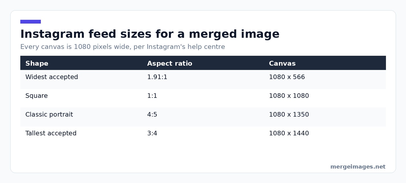
Instagram's help page on image resolution states the rule outright: "When you share a photo that has a width between 320 and 1080 pixels, we keep that photo at its original resolution as long as the photo's aspect ratio is between 1.91:1 and 3:4 (a width of 1080 pixels with a height between 566 and 1440 pixels). If the aspect ratio of your photo isn't supported, it will be cropped to fit a supported ratio."
| Shape | Aspect ratio | Canvas at 1080 wide |
|---|---|---|
| Widest Instagram accepts | 1.91:1 | 1080 x 566 |
| Square | 1:1 | 1080 x 1080 |
| Classic portrait | 4:5 | 1080 x 1350 |
| Tallest Instagram accepts | 3:4 | 1080 x 1440 |
Two rows catch people out. The tallest supported ratio is 3:4, not the 4:5 most size guides still print, so you have 90 more pixels of height than you probably think. And anything wider than 1.91:1 gets cropped, which is how a merged panorama loses its ends.
For a carousel, Instagram lets you post up to 20 photos and videos in one post, and the orientation you choose applies to every item in it. You cannot mix a square merge with a portrait one in the same carousel.
Reels are a different frame again. Instagram's reel specs allow an aspect ratio between 1.91:1 and 9:16 with a minimum resolution of 720 pixels, so build vertical merges at 9:16 and keep anything that matters out of the top and bottom eighth, where the interface sits. Stories fill the same shape, so one 9:16 canvas serves both.
Best Practices for Instagram Photo Merging
Match the light before you match the layout
Try it hereOpen the collage makerBuild a photo collageArrange your images into one clean layout, free.
Two photos shot an hour apart under different light read as two photos no matter how neatly you align them. Get white balance and exposure close before you merge. If one shot is cooler, warm it toward the other rather than splitting the difference, because a warm image reads as intentional and a blue one reads as broken.
Give the seam something to do
A merged image with no gap between panels reads as one badly stitched photo. A gap of 12 to 24 pixels on a 1080 pixel canvas says "these are two things" without turning the layout into a window frame. Below about 8 pixels the gutter disappears once Instagram re-encodes the file.
Choose the border colour on purpose
White gutters lift the whole tile and suit light photos. Black gutters make colour pop and work for food and product shots. Mid-grey is the one to avoid, because it reads as an accident rather than a decision. A brand colour works thin, as a 4 to 6 pixel line.
Side by Side, Grid, or Before and After
Three layouts cover almost everything.
Side by side is for two things being compared. Merge them with the horizontal image merge tool and keep both halves the same height, or the taller one ends up letterboxed. This is the layout for old versus new, two colourways, two angles.
Stacked is for a sequence with a direction: top is where you started, bottom is where you ended. Vertical image merge does this, and the widths need to match.
Grid is for variety rather than comparison. The photo collage maker handles three or more photos, and the honest ceiling is about six in a square before the individual images stop being legible on a phone.
Before and after deserves one extra note: label it. An unlabelled pair is ambiguous, and the viewer should never have to guess which half came first.
Step-by-Step Guide
- Choose the ratio. 4:5 at 1080 x 1350 is the safest default, since it takes the most vertical space without passing Instagram's 3:4 ceiling.
- Crop your sources to matching shapes. The image cropper gets every panel into the merge with the same proportions.
- Merge. Horizontal for two across, vertical for stacked, or combine photos online when you just want it done.
- Set the gutter. 12 to 24 pixels, one colour, applied evenly.
- Resize to the exact canvas. The image resizer takes you to 1080 x 1350, or whichever frame you picked, so Instagram has nothing left to decide.
- Export as JPEG at high quality. Instagram re-encodes anyway, and a huge PNG buys you nothing.
What Instagram's Compression Does to a Merged Image
Instagram's wording is that if you share a photo at a higher resolution, "we size it down to a width of 1080 pixels". That downscale is where merges get hurt, because a merge packs more hard edges into the same frame than a single photo does, and edges are the first thing compression eats.
I posted a three-panel product strip at 3240 x 1080 last month without thinking it through. That is 3:1, well outside the limit, so Instagram cropped to the widest frame it allows at that height, 1080 x 2063, and took about 589 pixels off each end. That ate most of the outer two panels, and what survived was then resized down to 1080 wide. Rebuilt as a 1080 x 1350 stack of two panels, the same photos held together fine.
Three habits survive the re-encode: export at the target size rather than letting Instagram resize, keep text above roughly 40 pixels tall on a 1080 wide canvas, and skip one-pixel dividers, which turn into grey smears.
The Crop That Eats Faces
Here is the failure mode worth planning around. If your merged file falls outside 1.91:1 to 3:4, Instagram crops it, and it crops from the edges inward. On a side-by-side portrait merge, the edges are exactly where the two faces are.
I lost a client's before-and-after that way. Two 1200 x 1200 frames merged side by side gave a 2400 x 1200 file at 2:1, just outside the limit, and the crop took 54 pixels off each side, exactly where the "before" and "after" labels sat. The fix is not a smarter crop, it is building to a supported ratio.
Tips for Maximum Engagement
- Put the strongest image where a left-to-right reader lands first: left in a side-by-side, top in a stack.
- Test the merge at thumbnail size first. Shrink it to about 160 pixels wide and see whether it still reads.
- Hold the gutter colour steady across a series so your profile grid looks deliberate.
Frequently Asked Questions
What size should a merged Instagram photo be?
Build it at 1080 pixels wide, then pick the height from Instagram's supported range of 566 to 1440 pixels. 1080 x 1350, which is 4:5, is the practical default because it fills the most vertical space in the feed. Instagram sizes anything wider than 1080 back down, so a 4000 pixel file gains you nothing.
How many photos can I merge into one Instagram post?
There is no cap on how many you can merge into one image, but there is a legibility limit. At 1080 pixels wide, six photos in a grid leaves each one roughly 360 pixels across. Past that, use a carousel: Instagram accepts up to 20 photos and videos in one post, and every slide keeps the full width.
Will Instagram crop my merged photo?
Only if the finished file falls outside 1.91:1 to 3:4. Inside that range Instagram keeps your framing at its original resolution. Outside it, the photo is cropped to the nearest supported ratio, and the crop comes off the edges, which is where merged layouts tend to put their most important content.
Should I merge photos or post a carousel?
Merge when the relationship between the images is the point, like a before and after or a size comparison, because the viewer gets it without swiping. Post a carousel when each photo needs to stand alone at full resolution. A carousel gives every slide 1080 pixels of width; a six-panel merge gives each about a third.
What file format should I use for a merged Instagram image?
JPEG at high quality. Instagram re-encodes whatever you upload, so a large PNG costs upload time without surviving as extra quality. The exception is a merge that is mostly flat colour and lettering, where PNG holds the glyph edges a little better going into the re-encode.
Before You Hit Share
Open the finished file, then shrink it to a thumbnail. If the layout still tells its story at 160 pixels wide, it will work in the feed. If it does not, the problem is almost never the photos. It is that you fitted too many into 1080 pixels. Drop one, rebuild at 4:5 with the image merger, and post that.

Bello builds useful software and writes thoughtful content to make sense of it all. He tests the tools himself and checks the facts before any of it goes in a guide.
Experimente Nossas Ferramentas de Imagem Gratuitas
Pronto para Experimentar?
Coloque essas dicas em prática com nosso editor de imagens online gratuito. Sem cadastro.
Make your social images, free


