
Summarise this article with:
Streaming platforms have specific album art requirements that go beyond basic dimensions. Spotify, Apple Music, Amazon Music, and Tidal all reject cover art for issues that aren't documented prominently. Independent artists submitting through aggregators (DistroKid, CD Baby, TuneCore) often see their releases delayed by these rejections, sometimes days before a planned release date.
This guide covers the 2026 spec sheet for major streaming platforms plus the common rejection reasons and the pre-submission workflow that keeps a release on schedule.
Required Specifications
Modern album art requirements:
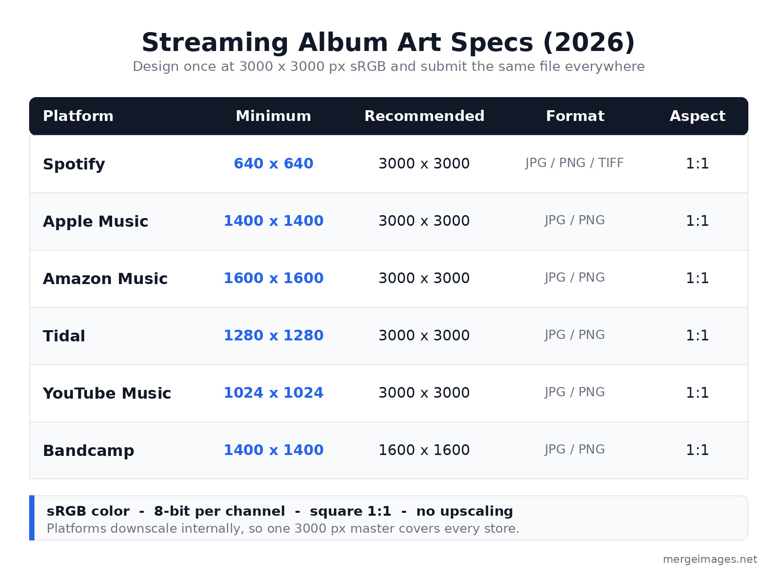
| Platform | Minimum Size | Recommended Size | Format | Aspect |
|---|---|---|---|---|
| Spotify | 640x640 | 3000x3000 | JPG, PNG, TIFF | Square 1:1 |
| Apple Music | 1400x1400 | 3000x3000 | JPG, PNG | Square 1:1 |
| Amazon Music | 1600x1600 | 3000x3000 | JPG, PNG | Square 1:1 |
| Tidal | 1280x1280 | 3000x3000 | JPG, PNG | Square 1:1 |
| YouTube Music | 1024x1024 | 3000x3000 | JPG, PNG | Square 1:1 |
| Bandcamp | 1400x1400 | 1600x1600 | JPG, PNG | Square 1:1 |
For maximum compatibility: design at 3000x3000 pixels and submit the same file to every aggregator. The platforms downscale internally, so a single high-resolution master covers every store from the now-playing screen on a phone down to an 80-pixel playlist row. Spotify accepts up to 10000x10000 pixels but warns against upscaling a low-resolution file to hit the recommended size, so start with real detail rather than enlarging.
File Format and Color
- Format: JPG (smaller file) or PNG (lossless, transparency supported). Spotify also accepts TIFF, but JPG and PNG are the safe defaults across every aggregator.
- Color mode: sRGB only (NOT CMYK, NOT Adobe RGB)
- Color depth: 8-bit per channel (24-bit total; 16-bit may be rejected)
- File size: keep it under 10 MB, since most aggregators reject anything larger
- Color profile: Apple wants an embedded sRGB profile; Spotify's docs say embedded color profiles aren't supported, so export in sRGB and don't rely on a profile carrying through
Apple Music in particular is strict about color. Submitting an image that was authored in CMYK or Adobe RGB without converting to sRGB first can shift the colors on playback, and a cover that looked rich in your editor may come out flat or muddy on a phone.
For more on color profiles, see image formats explained.
Common Rejection Reasons
Spotify and Apple Music reject covers for:
- URL or website displayed: the cover cannot include "spotify.com" or any platform URL
- Pricing or monetization references: "free", "$5", or similar
- Calls to action: "buy now", "stream", "download" prohibited
- Logos of streaming platforms: the Spotify logo or Apple logo cannot appear
- Misspelled artist or album name: the cover must match the metadata exactly
- Excessive contact info: avoid email, phone, and social handles on the cover
- Inappropriate content: nudity, violence, or hateful imagery (varies by platform)
Apple Music additionally rejects covers with:
- Any social handle, email, website, or competitor reference (no "follow me on" text)
- A year, date, or barcode printed on the artwork
- Visible camera UI elements (rare but it happens)
- Photo timestamps or metadata burned into the image
- Excessively low-resolution detail (pixelated or visibly upscaled)
The pattern across both platforms is the same: the cover is artwork, not a marketing flyer. Anything that reads as a promotion, a link, or a competitor mention is the fastest way to a rejection.
Text Considerations
Text on album covers:
- Required: artist name plus album title (consistent with the metadata you enter)
- Allowed: tracklist, copyright, label
- Prohibited: web addresses, prices, promotional text
- Best practice: text should stay readable at thumbnail size (160x160 or smaller)
For thumbnail readability at 160x160 pixels:
- Title text: at least 200 px tall on the source 3000x3000 image
- Artist name: at least 150 px tall on the source
- High contrast between text and background
- Avoid script or heavily stylized fonts at small sizes
Pre-Submission Checklist
Before submitting to aggregators:
- 3000x3000 pixels, square aspect
- sRGB color mode
- Under 10 MB file size
- No URLs, prices, or calls to action
- No streaming platform logos
- No year, date, or barcode on the artwork
- Artist name spelled correctly
- Album title matches metadata exactly
- Readable at 160x160 thumbnail
- No copyright violations
- No social handles or contact info
For more on small-format readability, see social media image sizes guide.
Vinyl and CD Cover Differences
Physical album covers have additional requirements:
- Vinyl LP cover: 12.375x12.375 inches plus 0.125-inch bleed = 12.5x12.5 inches at 300 DPI = 3750x3750 pixels
- Vinyl LP back cover: same dimensions
- CD cover: 4.75x4.75 inches plus bleed = 5x5 inches at 300 DPI = 1500x1500 pixels
- CD tray inserts: vary by manufacturer, so confirm the template before you design
For physical print:
- CMYK color mode
- 3mm bleed extending past the trim line
- Higher resolution (300 DPI minimum)
- Specific paper stocks affect color reproduction, so order a proof if the color matters
Streaming platforms accept the digital version (3000x3000 sRGB JPG); physical print needs a separate CMYK conversion. Treat them as two exports from one design, not one file you try to use for both.
For broader print prep, see print bleed margins dpi photo merging 2026.
Single vs Album Art
Singles (a single track) typically use:
- Simpler design
- More direct artist focus
- Often a portrait photo or minimal graphic
- The same 3000x3000 specs as albums
EPs (3-7 tracks):
- Same specs as albums
- A design that usually falls between a single and a full album
- Some artists reuse the full album art with a small track variation
Full albums:
- More elaborate designs
- May include band imagery or a themed concept
- A tracklist is sometimes integrated
For combining multiple visual elements (band photo plus typography plus decorative graphics) into a single cover, our overlay images tool handles layered composition without desktop software.
Cover Art Variations
Streaming platforms display cover art in many contexts, and the same file has to survive all of them:
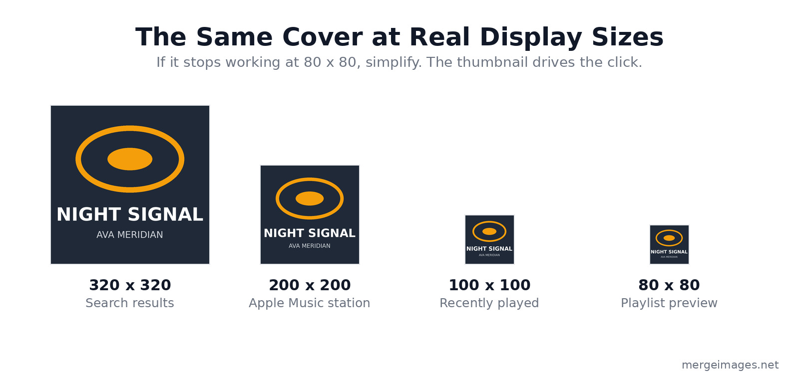
- Now Playing screen: full size (resolution depends on the device)
- Search results: 320x320 thumbnail
- Playlist preview: 80x80 thumbnail
- Recently played: 100x100 thumbnail
- Apple Music station: 200x200 thumbnail
Shrink the cover to 80x80 yourself and look at it. Can you still recognize the artist? Is the title readable even after compression? If not, simplify the design until it survives that size.
The thumbnail is what matters for click-through. Many listeners only ever see the small version before deciding whether to play, so the cover has to do its job at 80 pixels, not just at 3000.
Animated Cover Art (Spotify Canvas)
Spotify offers Canvas: a short looping video that plays in place of the cover in the Now Playing view. It is a completely separate asset with a different shape and a different file.
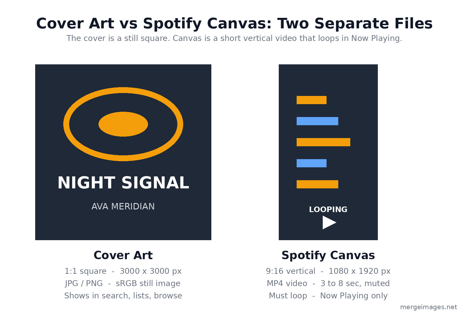
- Resolution: 1080x1920 (vertical 9:16, NOT 1:1), 720x1280 minimum
- Format: MP4
- Duration: 3 to 8 seconds
- Audio: muted (Canvas plays without sound)
- Looping: required, so the end should flow back into the start
Canvas is not a replacement for the cover art. Both files have to work on their own: the square still shows in search, playlists, and browse, while the vertical loop only appears once a listener opens the track. Keep important motion inside the central safe zone, because narrower phones crop the sides of a 9:16 video.
To produce the loop itself, you can animate the still cover or use a short clip; the image resizer is useful for prepping the square keyframe, and Spotify's "preview for narrower devices" toggle shows the crop before you publish.
Working with Aggregators
Aggregators (DistroKid, CD Baby, TuneCore) submit your music to streaming platforms. Their requirements:
- Cover art is uploaded once and sent to every platform
- Some have stricter pre-checks than others (DistroKid is among the strictest)
- Rejections come back to you through the aggregator, not the streaming service
- Re-submission is usually free
Common aggregator-level rejections:
- File too small (under 1500x1500)
- Wrong color mode (CMYK uploaded by mistake)
- File format issue (RAW or TIFF instead of JPG/PNG)
- Excessive file size (over 10 MB)
Catching these before you submit is the difference between a release that goes live on schedule and one that bounces back two days before launch.
Frequently Asked Questions
Can I use AI-generated cover art?
Yes, most platforms accept AI-generated covers. The same content rules apply (no inappropriate content, no platform logos, no dates or barcodes). Disclose AI usage in any commercial sale of the music, and double-check that the tool's license actually permits commercial release.
Should I trademark my album title?
For commercial releases with significant marketing, yes. Independent releases typically rely on copyright protection of the cover artwork itself, which is automatic the moment you create it.
What about explicit content?
Mark explicit content in the metadata. The cover itself shouldn't be excessive (nudity, gore). Spotify, Apple, and Amazon all run content review processes and will flag a cover that crosses the line even when the audio is correctly tagged.
How do covers compare across platforms in display quality?
Apple Music has the highest display quality (typically Retina displays at roughly 1440x1440 effective). The Spotify Web Player sits in the middle. YouTube Music tends to look softer because of heavier compression, which is one more reason to start from a clean 3000-pixel master.
Can I update the cover after release?
Yes, through your aggregator. Updates typically propagate to all platforms within 24 to 48 hours. Files already downloaded to a listener's device won't refresh automatically, so the old cover lingers there until they re-download.
The Bottom Line
For album cover art in 2026: design at 3000x3000 pixels, sRGB color mode, under 10 MB as a JPG. Avoid URLs, prices, platform logos, dates, and barcodes. Verify readability at 80x80 thumbnail before you submit. Use our photo collage maker for combining band photos with graphic elements, overlay images for typography placement, and image resizer for consistent dimensions across the square cover and the vertical Canvas. For physical vinyl and CD, add the 3mm bleed and a CMYK conversion as a separate export.
For more on visual branding consistency, see create professional profile picture. For broader print formats, see print bleed margins dpi photo merging 2026.

Bello builds useful software and writes thoughtful content to make sense of it all. He tests the tools himself and checks the facts before any of it goes in a guide.
Experimente Nossas Ferramentas de Imagem Gratuitas
Pronto para Experimentar?
Coloque essas dicas em prática com nosso editor de imagens online gratuito. Sem cadastro.
Design your visuals, free


