
Summarise this article with:
TikTok covers decide whether someone taps into your profile or keeps scrolling. The native file is 1080 x 1920 px at 9:16, but what matters is the 1080 x 1080 px center square, the only region that survives both the For You feed and the profile grid crop.
Why Covers Matter More in 2026 Than They Did Two Years Ago
TikTok's For You feed still auto-plays, so the thumbnail rarely decides whether someone watches a video that lands in their feed. But three surfaces are now genuinely thumbnail-driven:
- Profile grid. When anyone visits your account, they see a 3-column grid of static covers. A weak grid is a weak profile.
- Search results. TikTok's in-app search has grown substantially. Results show a cover image before the user taps, the cover is the click trigger.
- Collections and saved videos. Users organize saves into themed collections. The cover is the only identifier for each saved video.
I tested this by comparing my own profile's search-result impressions before and after replacing default first-frame covers with designed ones. Click-through on profile visits increased noticeably within a week, not a controlled experiment, but the direction was clear.
The Exact Specs You Need (Verified July 2026)
File: 1080 x 1920 px, 9:16 vertical, JPG or PNG, maximum 20 MB.
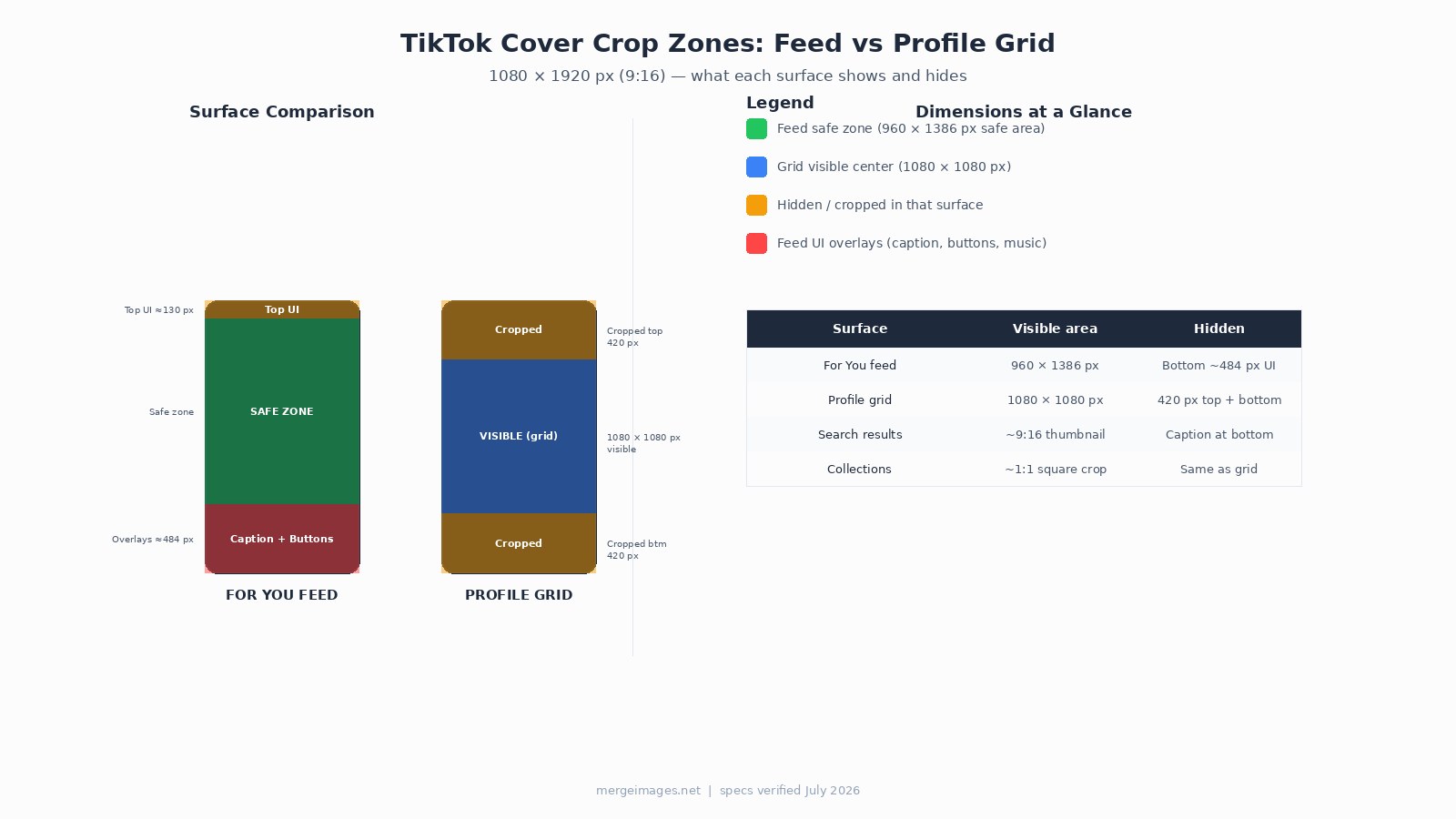
The profile grid applies a centered square crop, removing the top 420 px and bottom 420 px from your 1920 px tall cover. That leaves a 1080 x 1080 px visible window. If your hook text or face lands outside that window, the grid swallows it.
The For You feed shows more of the frame, but TikTok's UI overlays cover roughly the bottom 484 px (caption, music label, profile button, engagement icons). The effective feed-safe zone is approximately 960 x 1386 px centered in the frame, with a small top margin for the Following/For You tabs.
The practical rule: place everything that matters between the 22% and 75% marks of the full frame height. That band survives the grid crop and clears the feed UI.
How to Set or Change Your Cover
Before posting, tap "Select Cover" on the Post screen. Scrub the timeline to pick a frame, or tap "Upload" to choose a custom image from your gallery. TikTok also lets you add text to the cover directly in-app.
After posting, you can edit the cover by tapping the three dots on the video, choosing "Edit post," then "Edit cover." The window to change a cover after posting is approximately 7 days, and availability varies by account and region. Plan your cover before you post.
The Cover Checklist: Design It Once, Use It Every Time
The checklist below is the fastest way to audit a cover before it goes live.
What to put on the cover:
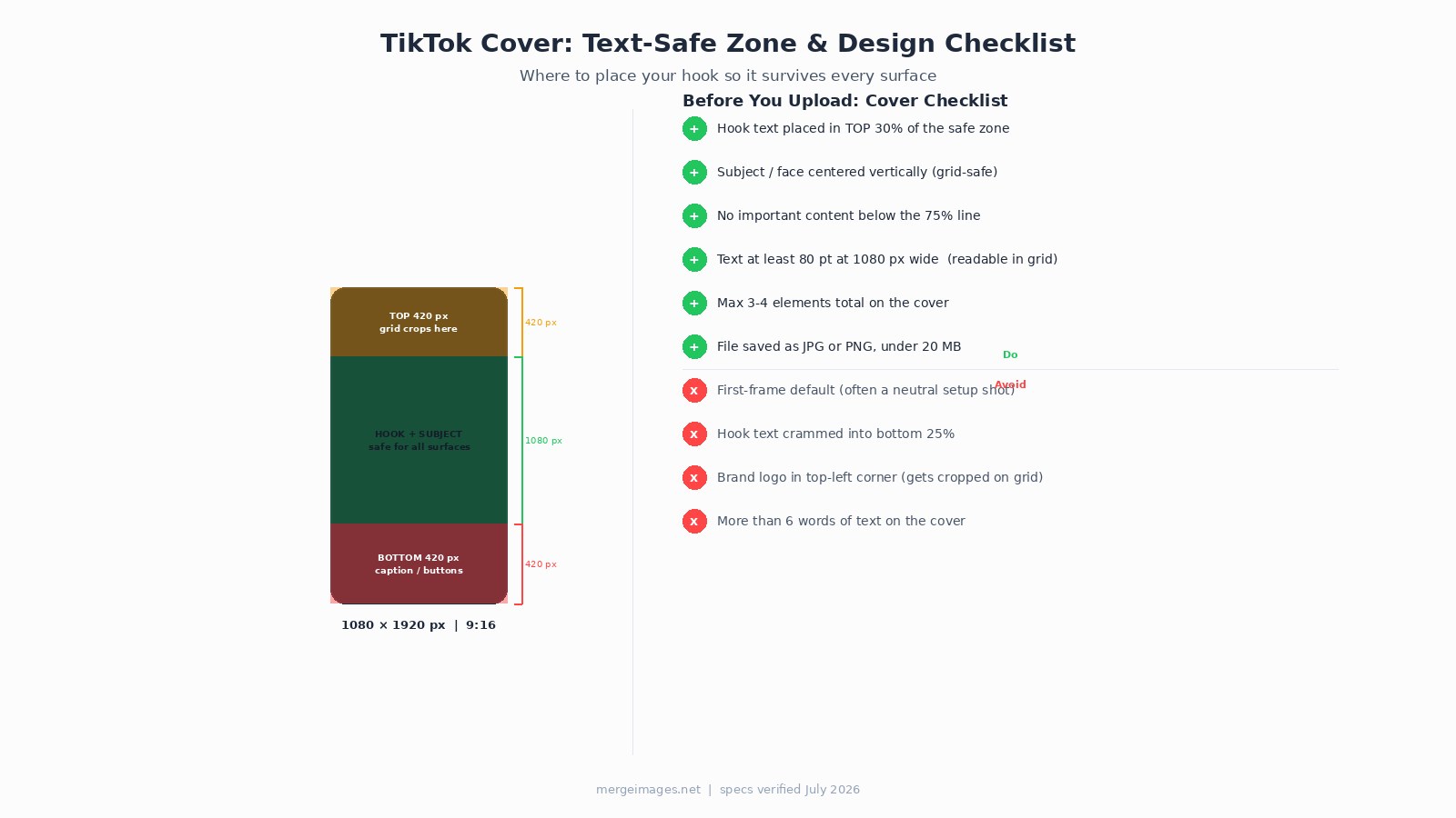
- Hook text or face in the top 30% of the center safe zone (top of the 1080 px visible window, roughly pixels 400-650 of the full 1920 px frame)
- Subject centered vertically so both the feed and grid show a complete composition
- Maximum 3-4 visual elements total
- Text no smaller than 80 pt at 1080 px export width, at the ~340 px grid thumbnail size, anything smaller becomes a blur
What to leave out:
- Default first-frame thumbnails. Most videos open on a setup shot, neutral expression, mid-sentence, blurry motion. That is not a hook.
- Text in the bottom 25% of the frame. TikTok's caption overlay sits there on the feed, and the grid crops it entirely.
- More than 5-6 words. Thumbnails render small. Short text reads; long text blurs into noise.
- Brand logos in the top corners. The profile grid's square crop trims the outer edges slightly, and top-corner logos on a vertical frame end up at the very top, either cropped or crowded by the screen status bar.
Three Cover Patterns That Work Across Surfaces
Pattern 1, Text hook on a clean frame
Pick the most visually clear frame from your video (good light, sharp face, uncluttered background). Overlay one short text hook using high-contrast color. White text on dark, or dark text on a light-colored block behind it. The text goes in the upper-center portion of the safe zone.
Use image cropper to cut your export to the exact 1080 x 1920 px frame before adding text elsewhere.
Pattern 2, Before / after split
A vertical split cover showing a before state on top and an after state below. Works for tutorials, transformations, makeovers, fix-it content. The visual contrast answers "what does this video do?" in under a second. Keep both halves within the safe zone, do not rely on the very top or bottom strips to carry content.
Pattern 3, Expression close-up with a short label
A tight crop on a face with a strong, readable expression, surprise, concentration, disbelief, paired with 2-4 words of caption. Faces register faster than objects in a grid view. The label tells the brain why it should care.
For precise resizing before any of these, image resizer lets you set exact pixel dimensions without distortion.
Carousel Strategy vs Cover Design: Different Goals
Cover design is about the single static frame. If you want to know how to structure a multi-image carousel post for engagement and watch-through, that is a different discipline covered in the TikTok photo carousel strategy guide. This post focuses exclusively on the cover.
Frequently Asked Questions
What size is the TikTok thumbnail file?
1080 x 1920 px at 9:16 is the native video frame, and TikTok accepts custom cover images at the same dimensions. The maximum file size for a custom cover upload is 20 MB. JPG and PNG are both accepted. For web-fast loading, a JPG under 300 KB is practical.
Does the profile grid show the full 9:16 cover?
No. The profile grid crops to a centered square, showing only the middle 1080 x 1080 px of the 1080 x 1920 frame. The top and bottom 420 px are both hidden. Design with this crop in mind, if your hook lives in those outer strips, your profile visitors never see it.
Can I change the thumbnail after I post?
Yes, with limits. TikTok allows cover edits within approximately 7 days of posting. Tap the three dots on the video, select "Edit post," then "Edit cover" and choose a frame or upload a custom image. Availability varies by account type and region.
How much text is readable on a TikTok thumbnail?
At grid thumbnail size (roughly 340 px wide on a standard phone screen), text below about 80 pt at 1080 px export becomes difficult to read. Aim for 3-5 words maximum. One strong line performs better than two crowded ones.
Should I use the same cover style for every video?
Visual consistency across your profile grid helps with brand recognition when someone visits your profile. A uniform color palette or text style makes the grid feel cohesive. That said, do not sacrifice cover effectiveness to match the grid, a video with a genuinely different subject can have a different look. The rule is internal consistency within a content series, not rigid uniformity.
What happens to the cover when TikTok shows it in search results?
Search shows a thumbnail in roughly 9:16 proportions before you tap. The feed-safe zone applies: avoid the bottom ~484 px because TikTok overlays caption text there. The top of the safe zone (from about the 7% mark down to the 75% mark of the full frame) is reliably visible in search results.

Bello builds useful software and writes thoughtful content to make sense of it all. He tests the tools himself and checks the facts before any of it goes in a guide.
Prueba Nuestras Herramientas de Imagen Gratuitas
¿Listo para Probarlo?
Pon estos consejos en práctica con nuestro editor de imágenes online gratuito. Sin registro.
Make your social images, free


