
Summarise this article with:
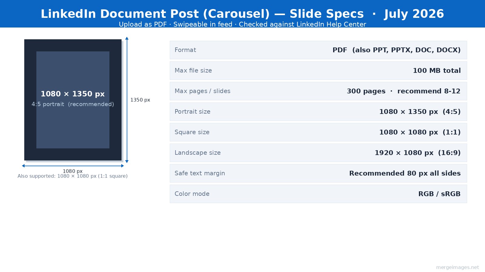
LinkedIn carousels are PDF document posts, the native multi-image carousel was retired in December 2023. Today you upload a multi-page PDF (up to 300 pages, 100 MB), and LinkedIn renders it as a swipeable slide viewer. The recommended slide canvas is 1080 x 1350 px (4:5 portrait). Here is the workflow that makes them work.
What "LinkedIn Carousel" Actually Means in 2026
The term "carousel" is informal, LinkedIn calls them Document posts. You upload a PDF, PowerPoint (PPTX), or Word (DOCX) file. LinkedIn converts it into a swipeable slide viewer that lives inside the feed without requiring viewers to leave the platform. A slide counter (1/8, 2/8...) appears in the bottom corner.
A separate multi-image post (up to 9 photos in a gallery collage) also exists, but it is not the same format. It does not have the slide-by-slide progression or the document download button that document posts carry.
The distinction matters for design: document posts use fixed page dimensions set at export time. Whatever canvas size you build in Canva, Figma, or Keynote becomes the pixel dimensions LinkedIn receives.
Document Post Specs (Checked LinkedIn Help Center, July 2026)
| Spec | Value |
|---|---|
| Recommended slide size | 1080 x 1350 px (4:5 portrait) |
| Square alternative | 1080 x 1080 px (1:1) |
| Landscape alternative | 1920 x 1080 px (16:9) |
| Preferred format | |
| Also accepted | PPT, PPTX, DOC, DOCX |
| Max file size | 100 MB |
| Max pages | 300 |
| Safe text margin | 80 px from all edges (recommended) |
| Color mode | RGB / sRGB (not CMYK) |
Portrait 4:5 wins on mobile because it fills more vertical feed space. I built a test PDF of 10 portrait slides at 1080 x 1350 px in July 2026: the file measured 280 KB, well inside the 100 MB ceiling even for solid-color backgrounds.
The PDF Workflow, Step by Step
Building in PDF-native tools keeps the design tight and export predictable.
Step 1, Set your canvas. In Canva, select "Custom size" and enter 1080 x 1350 px (or use the LinkedIn Carousel template, which is already this size). In Figma, create frames at 1080 x 1350 px and use the "Frames to PDF" plugin. In Keynote/PowerPoint, set slide size to a custom ratio that matches 4:5.
Step 2, Resize any images first. Every photo or graphic you drop into a slide should arrive at the right dimensions, not scaled down inside the design tool. Use MergeImages image resizer to bring each photo to 1080 x 1350 px before placing it, so the export does not introduce compression artifacts from resizing.
Step 3, Build your slides. A typical 10-slide structure that works well: hook (slide 1), problem (slides 2-3), insight or framework (slides 4-7), example or proof (slides 8-9), CTA (slide 10). Keep each slide focused on one idea.
Step 4, Export as PDF. In Canva: Share > Download > PDF Standard. In Figma: Plugins > Frames to PDF. In Keynote: File > Export > PDF. Verify the PDF opens cleanly in Preview or Adobe Reader, if a font substituted or an image looks blurry, fix it before uploading.
Step 5, Upload. On LinkedIn, click the document icon (looks like a page with a corner fold) in the post composer. Select your PDF. LinkedIn shows a preview of each slide, scroll through all of them before posting. If a slide crops unexpectedly, go back and check your canvas aspect ratio.
For combining multiple individual design images into a single layout before PDF export, the photo collage maker handles multi-panel compositions at a custom output size.
Slide Layout and Text-Safe Zones
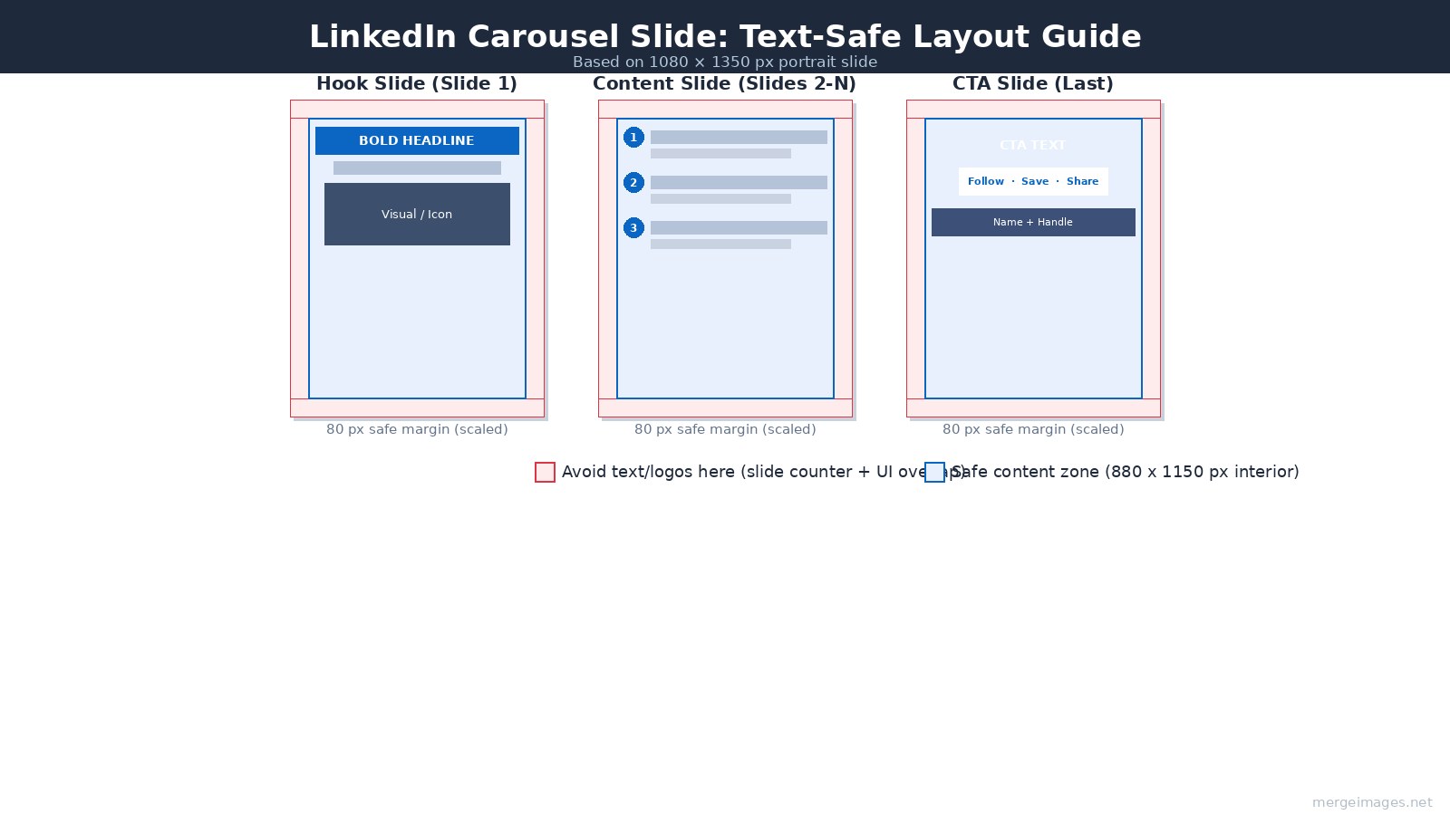
Keep all text and important visuals within 80 px of every edge. The slide counter ("2 / 8") overlaps the bottom center. Navigation arrows appear on the sides. Rounded phone bezels cut corners. On a 1080 x 1350 canvas, this gives you a safe content area of approximately 920 x 1190 px.
Typography sizing at export resolution:
- Headline: 60-80 pt
- Subheadline: 32-40 pt
- Body text: 24-28 pt
- Caption or attribution: 18-22 pt
Anything smaller than 24 pt body text is difficult to read in the feed at mobile size. Slide 1 gets special attention, the thumbnail visible before a viewer taps must communicate the topic in under two seconds.
Three layouts that work across most business content:
Text-dominant: Large headline, 1-2 supporting lines, white or brand-color background. Clean. Fast to produce. Works well for frameworks and numbered lists.
Photo + text overlay: Hero image behind a semi-opaque text panel. Best for storytelling slides and author-brand content.
Icon + single statement: One icon or small illustration paired with a 6-10 word statement. Good for slides 3-9 in a "one idea per slide" structure.
Slide 1 Design
The hook slide determines whether someone swipes to slide 2. It also appears as the post thumbnail in the feed before anyone interacts.
Design constraints for slide 1: readable at 400 px wide (feed thumbnail on mobile), no serif fonts smaller than 50 pt, nothing critical in the bottom 120 px (slide counter overlap is largest here).
Effective hook patterns, bold claim, counterintuitive statement, numbered list preview ("5 things I stopped doing"), or a direct question. The claim should be specific. "How I book 20 calls per week from LinkedIn" converts better than "My LinkedIn strategy."
Color and Typography Consistency
Pick a 2-3 color palette before building slide 1, then lock it. Every slide gets the same primary background, accent, and text color. Every slide uses the same 2 fonts (one for headlines, one for body).
LinkedIn's audience expects a professional, low-noise aesthetic. High-saturation multicolor palettes and decorative display fonts tend to underperform compared to clean, high-contrast designs with a clear hierarchy.
Keep the same typography hierarchy on all slides, if your headline is 72 pt on slide 1, it is 72 pt on slide 6. Inconsistency across slides reads as a production error.
End Slide CTA Design
The last slide needs one action and one action only. Competing CTAs reduce completion of any of them.
Common end-slide structures that work: follow prompt with name and headline; save-this-post with a one-line summary of what was covered; direct URL if the post is driving to a resource. Author headshot on the final slide increases perceived credibility, use LinkedIn profile picture maker to prepare a clean headshot at consistent crop and size before placing it.
One CTA per carousel. State it plainly.
Posting and Format Notes
Caption length: LinkedIn supports captions up to 3,000 characters. Document posts benefit from a substantive caption because the platform surfaces the post in search and feed recommendations partly based on text. A 400-800 word caption is not unusual for educational content.
Hashtags: 3-5 specific industry hashtags outperform generic high-volume ones. Placing them at the end of the caption keeps the reading flow clean.
Timing: Tuesday through Thursday, morning posting (time zone of your primary audience) is commonly cited by third-party schedulers, though LinkedIn has not published verified engagement data by time slot. Test against your own audience.
Document download: LinkedIn adds a download button to every document post automatically. Viewers can save the PDF. Design your slides knowing the document may be read outside LinkedIn, avoid content that only makes sense with the feed caption.
Frequently Asked Questions
How many slides is the right length for a LinkedIn carousel?
Most practitioners recommend 8-12 slides as a practical range. Under 6 slides often feels too thin to justify the format. The platform supports up to 300 pages, but carousels beyond 20 slides need tightly packed, substantive content to keep readers through to the CTA.
Can I upload images directly instead of a PDF?
Not as a swipeable carousel. LinkedIn's document post format requires a document file (PDF, PPTX, DOCX). You can post up to 9 individual images in a multi-image post, which displays as a scrollable gallery, but it does not have the slide-counter UI or the structured progression of a document post.
What happened to the native LinkedIn carousel format?
LinkedIn removed the native image carousel format for organic posts in December 2023. The current carousel experience is powered entirely by document posts (PDF uploads). Paid ads on LinkedIn still have a separate native carousel ad format.
Should I use portrait (4:5) or square (1:1) slides?
Portrait 4:5 (1080 x 1350 px) is the standard recommendation because it occupies more vertical space in the mobile feed. Square (1080 x 1080 px) works if you are reusing assets from Instagram or designing a template that needs to work across platforms. Pick one ratio and use it consistently across all slides in a carousel.
Does file size affect how LinkedIn renders the document?
LinkedIn imposes a 100 MB hard limit. In practice, a well-optimized 10-slide PDF at 1080 x 1350 px runs around 280 KB for typical design work, far below the ceiling. File size becomes relevant if you are embedding high-resolution photography on every slide. Export PDF at screen resolution (72-96 ppi) rather than print resolution (300 ppi) to keep the file manageable.
Can I edit a document post after uploading?
LinkedIn does not allow you to replace the document after posting. You can edit the text caption and delete the post. If a slide has an error, you need to delete the post, fix the PDF, and repost.

Bello builds useful software and writes thoughtful content to make sense of it all. He tests the tools himself and checks the facts before any of it goes in a guide.
Prueba Nuestras Herramientas de Imagen Gratuitas
¿Listo para Probarlo?
Pon estos consejos en práctica con nuestro editor de imágenes online gratuito. Sin registro.
Make your social images, free


