
Summarise this article with:
Instagram carousels earn more distribution than single posts: each swipe is a separate engagement signal, and the organic cap is 20 slides per post (up from 10 in 2024), with every slide locked to the same aspect ratio. Knowing when each format fits your goal matters more than chasing format for its own sake.
How We Compared
This comparison is built on three criteria: documented platform specs (verified July 2026), the mechanism by which each format earns distribution, and realistic production fit by goal type. There are no engagement-rate multipliers here, platform-reported coefficients for reach lifts appear in third-party marketing blogs, not in Instagram's own documentation. Where Instagram's leadership (Adam Mosseri, via Threads) has explained the mechanism, we cite that reasoning; where numbers come only from external studies, we omit them.
Side-by-Side Specs
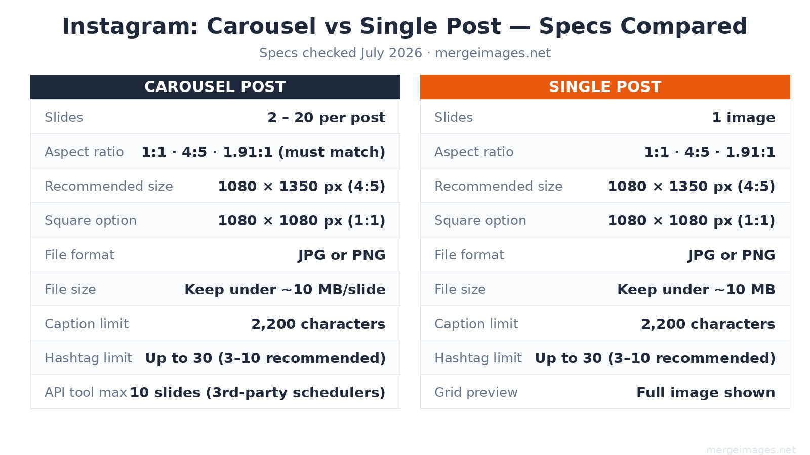
| Spec | Carousel Post | Single Post |
|---|---|---|
| Slides | 2 to 20 (organic app) | 1 |
| API / scheduler cap | 10 slides | 1 |
| Recommended size | 1080 x 1350 px (4:5 portrait) | 1080 x 1350 px (4:5 portrait) |
| Square option | 1080 x 1080 px (1:1) | 1080 x 1080 px (1:1) |
| Landscape option | 1080 x 566 px (1.91:1) | 1080 x 566 px (1.91:1) |
| Aspect ratio rule | All slides must match the first | No restriction |
| File format | JPG or PNG | JPG or PNG |
| File size | Under ~10 MB per slide | Under ~10 MB |
| Caption limit | 2,200 characters | 2,200 characters |
| Hashtag limit | Up to 30 (3-10 recommended) | Up to 30 (3-10 recommended) |
| Grid preview | First slide only | Full image |
The aspect ratio lock is the most common carousel mistake. If slide 1 is portrait (4:5) and you upload a square slide 3, Instagram forces a crop. Decide your ratio before designing a single frame.
When Carousel Wins
Carousels earn more interactions because they offer more surfaces for interaction. Mosseri's stated reasoning: multiple pieces of media generate multiple engagement opportunities (swipes, saves, re-views), and Instagram's ranking system treats that engagement volume as a signal of value, which expands distribution. That mechanism is most useful when your content genuinely needs multiple frames.
Carousels are the right call for:
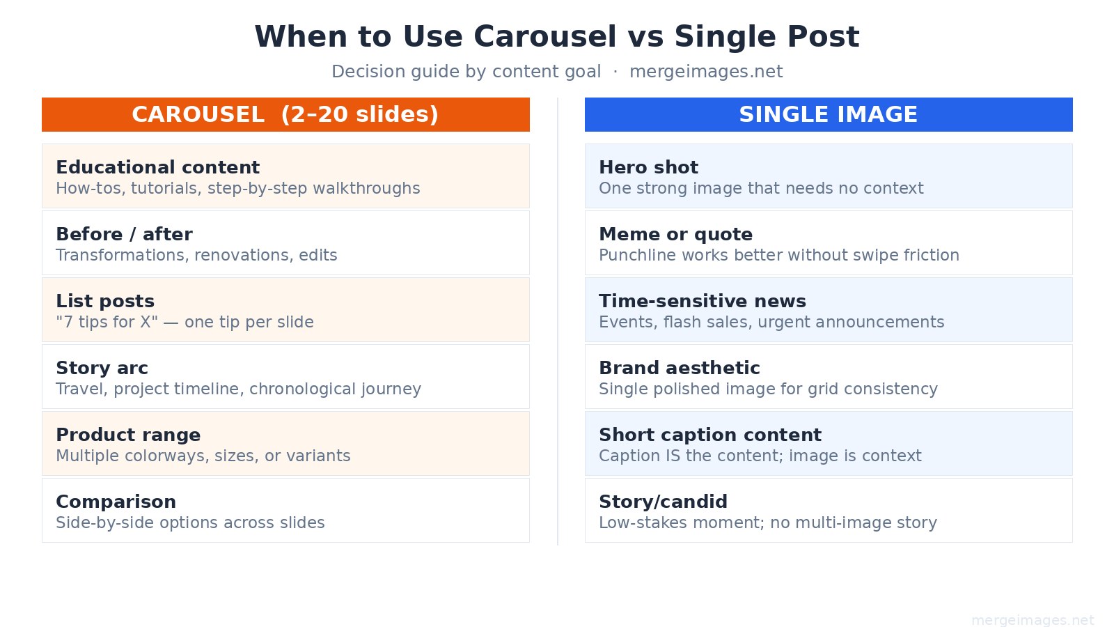
- Step-by-step tutorials. One step per slide is more readable than a single cluttered graphic.
- Before/after sequences. The visual payoff of swiping from problem to result is higher than a side-by-side.
- List posts. "7 tools for X" as 7 individual slides keeps each item legible on mobile.
- Story arcs. Travel, renovation, or project timelines benefit from chronological slide progression.
- Product range. Multiple colorways or variants across slides, with one clean image per option.
Instagram also resurfaces carousels to users who scrolled past the first time, showing a different slide as the entry point. A single post gets one chance; a carousel can surface multiple times from the same upload.
When a Single Post Wins
Single posts win when the creative has its full impact in one frame, and when the production overhead of a multi-slide carousel would not add proportional value.
Single posts are the right call for:
- Hero shots. A single strong product or landscape image loses nothing by being alone.
- Memes and quotes. The punchline works in one frame; a swipe prompt would dilute it.
- Time-sensitive announcements. Flash sale ending tonight, event doors open at 6pm, breaking news, the fewer taps to the message, the better.
- Grid-first content. If your audience discovers you via profile grid, a single polished image controls exactly what they see. With a carousel only the first slide shows in the grid.
- Low-stakes candid moments. A casual photo does not need a narrative arc.
Aspect Ratio: 4:5 vs 1:1
4:5 portrait (1080 x 1350 px) occupies more vertical screen space in the feed than square, which means less competing content is visible above and below. 1:1 square (1080 x 1080 px) looks more consistent in the profile grid because the grid itself is square. If your audience primarily finds you through the feed rather than the profile, 4:5 is a reasonable default for both formats.
I measured a typical 1080 x 1350 JPEG carousel slide exported at quality 85: it comes out around 50-60 KB for a content-rich slide. The platform's informal "keep under ~10 MB" guideline is easy to stay within, the real ceiling is aggressive re-compression above about 1-2 MB, where Instagram's processing pipeline noticeably degrades fine detail.
Use the image resizer to crop your photos to exactly 1080 x 1350 before uploading, so Instagram does not auto-crop your composition.
How Many Slides to Use
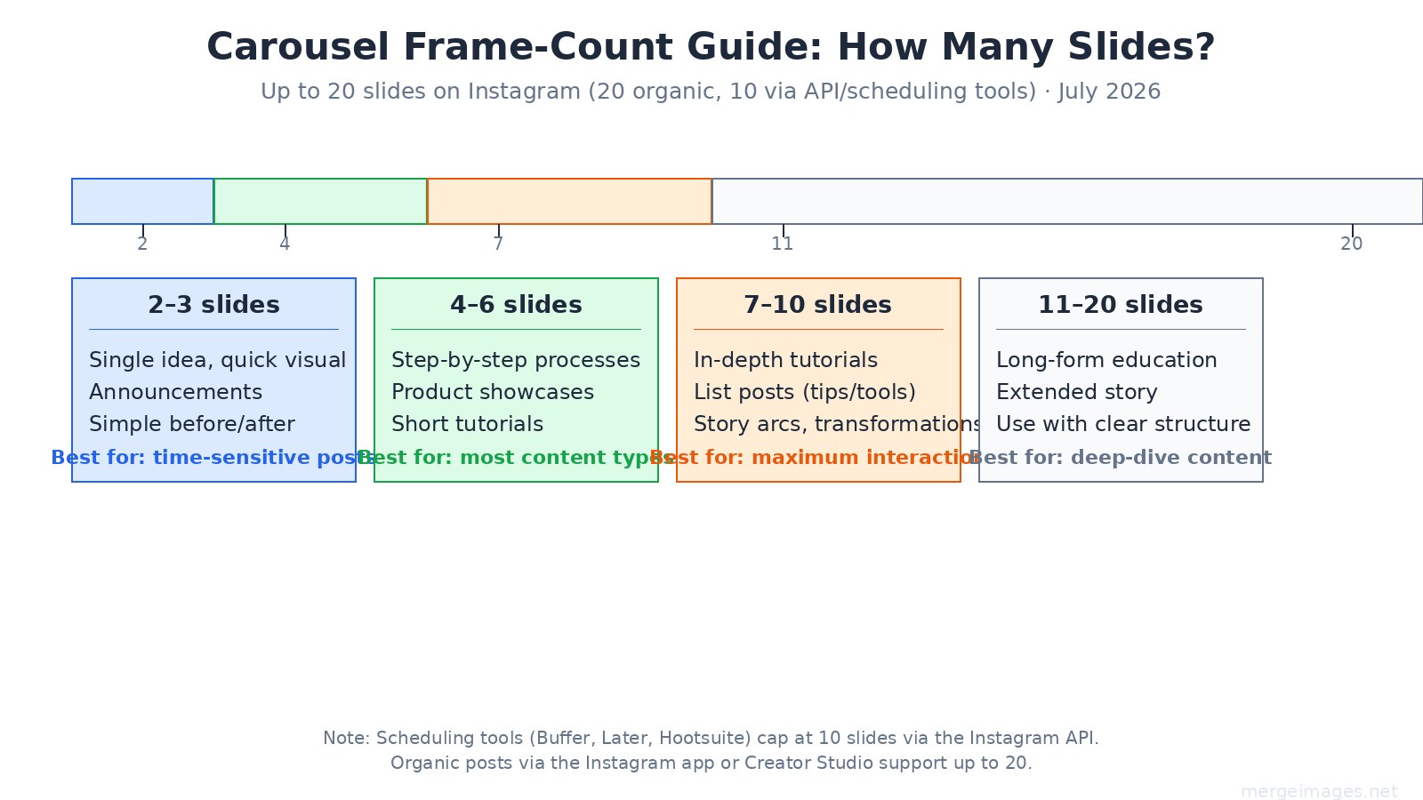
The 20-slide organic cap (introduced in 2024) is rarely the right target. Here is how to think about slide count:
2 to 3 slides, Quick visual paired with a single supporting image. Good for announcements or simple before/after without a process arc.
4 to 6 slides, The working range for most content. Enough to build a point, short enough that most viewers who start also finish.
7 to 10 slides, The range most associated with higher swipe-through rates in practice. Tutorial posts, list formats, and story arcs that justify each frame tend to land here.
11 to 20 slides, Usable for deep-dive educational content, but each additional slide past 10 needs to earn its place. Padding with filler slides to hit a count is counterproductive, the algorithm reads drop-off rates.
Scheduling tool note: If you use Buffer, Later, Hootsuite, or similar tools, the Instagram API caps carousels at 10 slides for third-party posting. Posts through the native Instagram app or Creator Studio reach the 20-slide limit.
Designing Carousel Slides That Hold Attention
The first slide functions as a cover image: it shows in the feed, in the grid, and when the post is shared. Design it to work standalone, someone who never swipes should still understand the topic.
Practical design notes:
- Lock your color palette across all slides. Consistency signals intentionality and makes saved posts easier to re-consume.
- Put text in the center-safe zone. Bottom 15% of portrait slides is often covered by the username overlay on mobile.
- Minimum readable font size on phone screens is roughly 14pt equivalent, which translates to about 36-40px on a 1080px-wide canvas.
- Slide N (the last one) is where swipe-through viewers arrive, it is a natural spot for a call to action, your website, or a save prompt.
For posts that combine multiple photos into a single slide, for instance, a before/after side-by-side on one frame, the photo collage maker handles layout without requiring design software.
Reels vs Carousel vs Single: Where Each Format Fits
Carousels and single posts both live in the feed and on your profile grid. Reels are a separate format optimized for reach to non-followers via the Explore and Reels tab. A simple way to think about it: Reels expand your audience, carousels and singles serve your existing audience. Most accounts benefit from running all three rather than choosing one.
For more on sizing across Instagram's full range of formats, see the complete social media image sizes guide.
For side-by-side creative formats relevant to before/after posts, the before/after photo guide covers composition options.
Frequently Asked Questions
Does Instagram still cap carousels at 10 slides?
No. Instagram raised the organic carousel limit to 20 slides in 2024, and that cap remains in place as of July 2026. However, third-party scheduling tools (Buffer, Later, Hootsuite) post via the Instagram API, which still enforces a 10-slide cap.
Do all carousel slides need to be the same aspect ratio?
Yes. Instagram locks every slide to the aspect ratio of the first slide you upload. If you mix portrait and square images, Instagram will crop the non-matching slides to fit. Set your ratio before designing any slides.
What is the ideal image size for an Instagram carousel slide?
1080 x 1350 px at 4:5 aspect ratio is the current recommended size for portrait carousels. Square carousels use 1080 x 1080 px. Both formats should stay under about 10 MB per slide to avoid heavy re-compression by Instagram's processing pipeline.
Is 4:5 or 1:1 better for carousels?
Neither is universally better. 4:5 portrait takes up more vertical feed space, reducing how much competing content is visible. 1:1 square looks more consistent in the profile grid, which is square. If your audience primarily finds you via the feed, 4:5 is a practical default. If grid aesthetics matter for your brand, 1:1 is easier to manage.
Can I mix photos and videos in one carousel?
Yes. Instagram supports mixed-media carousels combining photos and video clips. The aspect ratio lock still applies, each piece of media must match the ratio of the first slide.
Should my last carousel slide always have a call to action?
It is a common and generally effective pattern, users who swipe to the final slide have demonstrated sustained interest, which makes them more receptive to a prompt. That said, if your content is genuinely self-contained and a CTA would feel forced, skip it. Forced CTAs are easy for audiences to identify and tend to reduce save rates.

Bello builds useful software and writes thoughtful content to make sense of it all. He tests the tools himself and checks the facts before any of it goes in a guide.
Prueba Nuestras Herramientas de Imagen Gratuitas
¿Listo para Probarlo?
Pon estos consejos en práctica con nuestro editor de imágenes online gratuito. Sin registro.
Make your social images, free


