
Summarise this article with:
YouTube thumbnails built from two or more merged images consistently out-click single-image thumbnails. Split-screen comparisons, reaction shots next to the subject, and before/after reveals create visual tension that makes a viewer stop scrolling. A single photo shows one thing. A merged thumbnail poses a question, and the click is the answer.
This guide covers the exact specs YouTube wants, the four merge layouts that pull the most clicks, and the step-by-step way to build one without opening Photoshop.
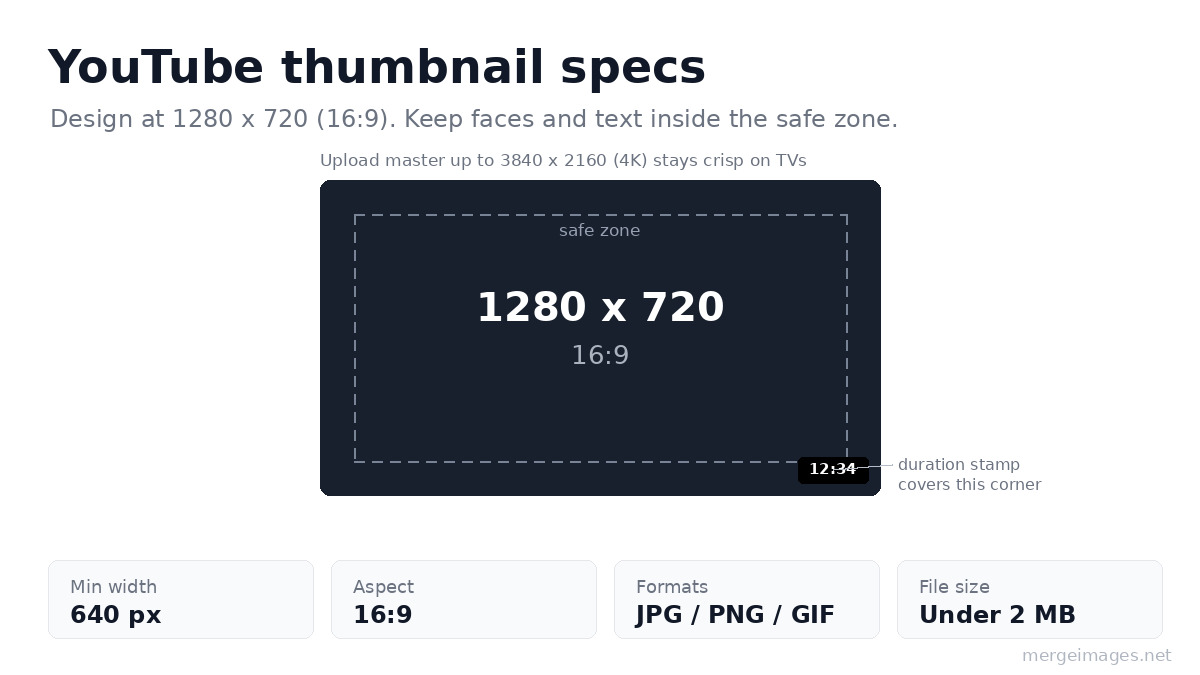
YouTube Thumbnail Specs
Get the frame right first. Off-ratio images get letterboxed or auto-cropped in ways that look amateur and bury your subject.
| Requirement | Value |
|---|---|
| Recommended size | 1280 x 720 px |
| Aspect ratio | 16:9 |
| Minimum width | 640 px |
| Master file (optional) | up to 3840 x 2160 (4K) |
| Format | JPG, PNG, GIF |
| File size | Under 2 MB to play safe everywhere |
Two details that the bare numbers miss:
- The duration stamp covers the bottom-right corner. YouTube prints the video length over that corner on the watch feed and search, so never put your key face or text there. Keep the important stuff in the center and upper two-thirds.
- Vertical and mobile feeds crop tighter than 16:9. On a vertical video, YouTube can swap your 16:9 thumbnail for a 4:5 auto-crop on the home and subscriptions feeds. Design with a centered subject so it survives the crop.
YouTube now also accepts a 4K (3840 x 2160) master and raised the file-size ceiling on newer TV surfaces, but 1280 x 720 under 2 MB is the size that looks correct on every device. Build at that size and you are covered.
High-CTR Thumbnail Layouts
These four layouts do the heavy lifting. Each one is a single 16:9 frame holding two or more merged images.
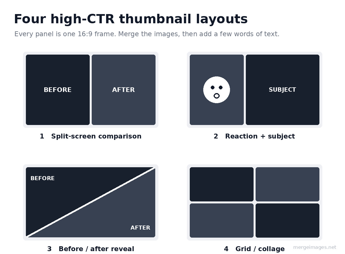
1. Split-Screen Comparison
Two images side by side: before/after, old vs new, cheap vs expensive. This layout works for:
- Product reviews and comparisons
- Transformation videos (fitness, home renovation)
- Tech comparisons (iPhone vs Android)
How to build it: Upload both images to the Image Merger, choose "Horizontal", and set spacing to 3 to 5 px with a white or black separator so the two sides read as two distinct things.
2. Reaction + Subject
Your face reacting on one side, the subject on the other. The expression carries the curiosity; the subject tells viewers what they will see. This layout works for:
- Reaction videos
- Commentary channels
- Review content
How to build it: Remove the background from your reaction photo so your head sits cleanly on the frame, then merge it with the subject image. A clean cutout always beats a rectangular photo-in-photo box.
3. Before/After Reveal
One image flowing into another, usually with a diagonal split or an arrow pointing from old to new. The diagonal reads as motion, which is why renovation and glow-up channels lean on it.
How to build it: Merge two images side by side, then drop a diagonal divider or an arrow on top in any basic editor. A bright divider line sells the "two states" idea instantly.
4. Grid / Collage
Four to six images in a grid showing variety, a tier list, or a progression. Works for:
- "Top 10" and ranking videos
- Collection and haul showcases
- Travel and recap compilations
How to build it: Use the Photo Collage Maker with a 2x2 or 3x2 grid. Keep the gutters thin and uniform so the grid looks deliberate rather than busy.
Step-by-Step: Build a Split-Screen Thumbnail
Here is the whole flow for the most reliable layout, start to finish.
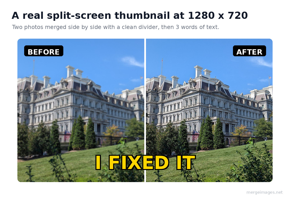
- Prepare both images. Crop them to the same height so the two halves line up. Square-ish crops sit better in a split than tall portrait shots.
- Upload to the Image Merger. Drop both files in.
- Choose "Horizontal". This stacks them left and right for a true split-screen.
- Set spacing to 3 to 5 px. A thin white or black divider keeps the two sides from blurring into one image.
- Export as PNG at maximum quality. PNG keeps edges crisp before YouTube re-compresses the file.
- Resize to 1280 x 720. Use the Image Resizer to hit the exact frame if your merged file came out a different size.
Add three words of text and one bright accent color, and you have a thumbnail that reads in under a second on a phone.
Platform-Specific Merge Tools
Building for more than one platform? Each of these is pre-set to the right aspect ratio:
Resolution Tips
- Always work at 1280 x 720 or larger. Scaling up from a small file gives you soft, blocky text.
- If your source images are low resolution, upscale them with AI first, then merge. A sharp small photo beats a stretched large one.
- YouTube compresses thumbnails hard, so start from the highest quality you can and export PNG before the final save.
- If your file ends up over 2 MB, run it through the Image Compressor to get under the cap without a visible quality drop.
What Makes a Thumbnail Click-Worthy
The frame and the merge get you in the game. These four habits win the click:
- High contrast. Bright colors against dark backgrounds, or a lit subject against a darkened scene. Contrast is what survives a tiny mobile preview.
- Readable text. If you add words, keep it to 3 to 5, set large, with a contrasting outline. Most views happen on phones where the thumbnail is barely a thumbnail.
- Emotional faces. A surprised, delighted, or shocked expression pulls the eye and hints at a payoff. This is why the reaction + subject layout works so well.
- Visual tension. Two contrasting things in one frame, before vs after, this vs that, makes the viewer want to resolve the gap by clicking.
- A centered subject. Remember the duration stamp and the mobile crop. Anything you put in the corners can get covered or cut.
Conclusion
The most clicked thumbnails on YouTube use merged images to tell a story in one frame: a split that begs a comparison, a reaction that promises a payoff, a before and after that shows the transformation. Build them free with the Image Merger and the Photo Collage Maker, size to 1280 x 720, and keep your subject centered and high-contrast. No Photoshop, no subscription, done in a couple of minutes.
Bello builds useful software and writes thoughtful content to make sense of it all. He tests the tools himself and checks the facts before any of it goes in a guide.
Probieren Sie Unsere Kostenlosen Bildtools
Bereit es Auszuprobieren?
Setzen Sie diese Tipps mit unserem kostenlosen Online-Bildeditor in die Praxis um. Keine Anmeldung erforderlich.
Bilder Jetzt Zusammenfügen


