
Summarise this article with:
Combining screenshots works best in short runs: stack three to five steps at one fixed width, crop each frame to the region that matters, and redact anything sensitive before the file leaves your machine. GitHub caps issue images at 10 MB, so a 9,000 pixel tall PNG is usually the wrong answer even when it fits.
A merged screenshot is a small piece of writing. It has to be readable at the width your wiki renders it, and it must not leak the API key that happened to be on screen. Most of the work is deciding what goes in the frame.
Why Combine Screenshots?
Google's technical writing course puts the case for restraint better than most style guides: "Providing any graphics, good or bad, makes readers like the document more; however, only instructive graphics help readers learn." A merged image is only worth building if the combination teaches something the separate frames do not.
Photo: Vanessa Garcia via Pexels
Three cases where it does.
Sequences. Five steps stacked vertically read as one motion. Five separate embeds make the reader scroll and lose their place.
Relationships. Side by side is the only layout that shows a before and an after honestly, because the eye compares them without a scroll in between.
Handoff. One file attached to a ticket beats five, especially when the person triaging it is on a phone.
Best Practices for Screenshot Documentation
Capture at one fixed width
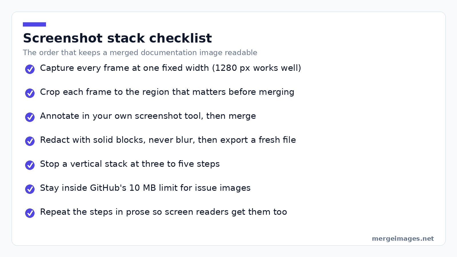
This is the whole trick for stacks that do not look ragged. I keep a browser window at 1280 px wide for anything destined for docs, so every frame lands at the same width and the merged column has clean edges. If your sources already differ, even them up before joining, because scaling a screenshot twice is what turns crisp UI text into mush.
Annotate first, merge second
Arrows, numbers and highlight boxes go on the individual frames, in whatever screenshot tool you already use. Our merge tools join images, they do not draw on them, so annotation is a step that happens before the upload. Google's course backs the habit: "Callouts in pictures are often better than paragraph long explanations of the pictures," and its own example is adding a red oval to focus attention on the relevant part of a screenshot.
Crop to the region that matters
A full 1920 px desktop capture spends most of its pixels on a taskbar nobody needs to see. Crop to the panel, the dialog or the error, and the merged result stays readable when the wiki scales it down to 700 px.
Pick the layout from the content
Vertical for sequences and long processes with our vertical image merge. Horizontal for two states you want compared, with the horizontal image merge. Mixing both in one image usually means you are trying to fit too much.
Creating Documentation Images
For bug reports: capture the error state, then the console or network panel, then the expected behaviour if you have it. Stack them vertically in that order, with the error at the top so the triager sees it first.
For tutorials: one frame per step, numbered on the frame itself rather than only in the caption, merged in sequence. Keep the numbers in your text too, so the steps exist outside the picture.
For comparisons: before on the left, after on the right, both labelled. Unlabelled comparisons get read backwards more often than you would think.
Redacting Before You Share
This is the part that goes wrong in public repositories.
Cropping beats covering. If the secret is at the edge of the frame, crop it out rather than paint over it, then verify the exported file rather than the preview.
Where you must cover something in the middle, use a solid block. Our censor tool will lay one down. Blur and pixelation look tidy but they are transformations of the original pixels rather than a deletion of them, and small text under a light blur has been recovered before, so treat solid coverage as the only redaction you can reason about.
Then there is the trap in the editor itself. In 2023 Google patched CVE-2023-21036, a "possible failure to truncate images due to a logic error" in the Pixel screenshot editor: a cropped screenshot was written over the original file without shortening it, so the cropped-out image data was still sitting in the saved PNG. Microsoft shipped a fix for the same shape of bug in the Windows Snipping Tool as CVE-2023-28303. The habit that protects you is simple: after redacting, export a fresh file rather than saving in place, and check that the file size moved.
One honest note on where the work happens. Our merge and censor tools process your upload on our own servers, where files are deleted automatically within 7 days and are never shared or used to train models. If a screenshot contains live credentials, redact it locally before it goes anywhere at all, ours included.
Technical Considerations
Resolution. Keep native pixels. Resampling a screenshot is the fastest way to make 11 px UI labels illegible, and no sharpening pass gets them back.
Format. PNG for anything with interface text, because it is lossless and text edges stay hard. JPEG belongs on screenshots that are mostly photographic, since its artefacts cluster exactly around sharp glyphs.
File size. GitHub allows 10 MB for images and GIFs in issues and comments, and 25 MB for other files. Jira Cloud's default per-file limit is far higher, around 1 GB, so the tracker is rarely what stops you. Page weight and the reader's patience are. Run the finished image through our image compressor before embedding it in a wiki page that people open twenty times a day.
Accessibility. A screenshot is not an "image of text" in the WCAG sense: the W3C's own note excludes "graphs, screenshots, and diagrams which visually convey important information through more than just text" from that criterion. That is not a free pass, though. A merged stack is opaque to screen readers, to your site search and to machine translation, so the steps have to exist in the prose as well as in the picture.
Tools and Workflow
The workflow that has held up for me:
- Capture every frame at the same window width.
- Crop and annotate each one in your screenshot tool.
- Upload them in order, set the direction, add 20 to 30 px of spacing so the frames read as separate panels.
- Choose a background colour that contrasts with the app you captured, otherwise white UI on white gutters looks like one long screenshot.
- Export PNG, then compress.
The last release note I put together ran to nine steps. Stacked at 1280 px wide, the merged PNG came out 8,300 pixels tall and 2.4 MB, and it was useless: on the docs page it rendered as a thin ribbon nobody could read without opening it in a new tab. Splitting it into three images of three steps each, with text between them, was better documentation and a third of the bytes.
Try it hereOpen the image mergerMerge two photos in secondsCombine images side by side or stacked, free, no login.
Frequently Asked Questions
How many screenshots should go into one merged image?
Three to five is the range that stays readable. Google's technical writing course offers a useful rule of thumb for illustrations generally: "don't put more than one paragraph's worth of information in a single diagram." Past that, the image gets scaled down by the page it lives on and every label becomes unreadable. Split into several merged images with explanatory text between them.
PNG or JPEG for screenshots?
PNG, almost always. Screenshots are large flat areas of colour with hard-edged text, which is the case lossless compression handles well and JPEG handles badly. JPEG puts its artefacts right around sharp glyph edges, so body text in a UI screenshot picks up a visible halo. Use JPEG only when the screenshot is mostly photographic content.
Is blurring enough to hide a password or an email address?
No. Blur and pixelation transform the original pixels rather than removing them, and recovering small text from a light blur or a coarse pixelation is a known attack. Cover sensitive regions with solid blocks, or crop them out of the frame entirely, and re-export the file afterwards rather than saving over the original.
What width should I capture at?
Pick one width and keep it for the whole document. 1280 px suits most web app documentation, since it is wide enough to show real layouts and narrow enough that a stack does not need scaling. What matters more than the exact number is that every frame in a merged image shares it.
Will a very tall merged image break in a wiki or a tracker?
It will not break, but it will be scaled to the container width, and a 9,000 pixel tall image squeezed into a 700 px column is unreadable. Trackers are generous on size, so the constraint is legibility rather than upload limits. Shorter stacks, more of them.
What to Do Next
Set a capture width, crop hard, redact with solid blocks, and stop stacking at five frames. That covers almost every documentation screenshot you will build.
The failure mode to watch for is the opposite of the one people expect. Nobody complains that a merged image was too small. They quietly stop reading when it is too tall.

Bello builds useful software and writes thoughtful content to make sense of it all. He tests the tools himself and checks the facts before any of it goes in a guide.
Essayez Nos Outils d'Image Gratuits
Prêt à Essayer ?
Mettez ces conseils en pratique avec notre outil de fusion d'images en ligne gratuit. Sans inscription.
Clean up your images, free


